
Exhibition dates: 5th May – 13th August, 2023
Curator: Donald Albrecht

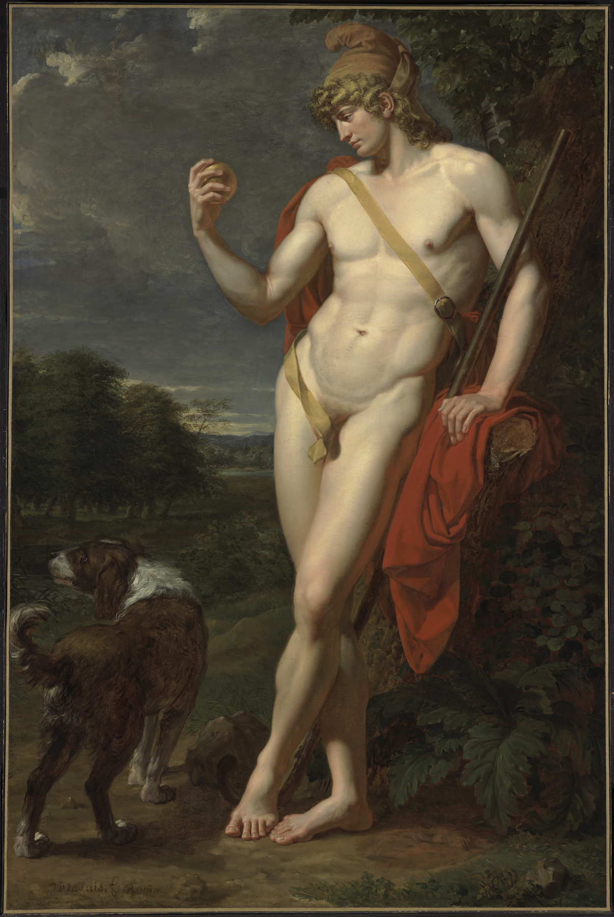
J.C. Leyendecker (American, 1874-1951)
Ivory Soap It Floats
Painting for Ivory soap advertisement, 1900
Gouache on board
Private collection
Image courtesy of the National Museum of American Illustration, Newport, RI
Featured in mainstream national magazines, ads for Ivory soap often depicted scenes of conventional domesticity. Some, however, were erotic, like this one by Leyendecker featuring a man in a floor-length robe, whose crotch is suggestively rendered.
The Eye of the Beholder
“Leyendecker’s subjects exemplify an elite white masculinity that was hardly representative of the diversity of the United States in his time, or since” observes Sonya Abrego. The artist’s subjects are white, cultured, privileged, “upholding racial, social and nationalist hierarchies”.
But how representations were and are understood depends on the eye of the beholder. At the time that Lyendecker was painting and illustrating commercial magazines his flirtatious subliminal erotic messages would have been all too decipherable to a knowing gay male readership – even as these very illustrations “passed” the scrutiny of heterosexual normativity. For gay men “passing” allowed them to hide their real identity and to fit into society without discrimination and fear of loosing their job, their home and/or going to jail.1 Leyendecker’s works both hide and transgress the taboo when they pass inspection.
For the initiated, Leyendecker’s paintings and illustrations were at the very heart of the subversion of hegemonic masculinity – “a practice that legitimises men’s dominant position in society and justifies the subordination of the common male population and women, and other marginalised ways of being a man.”2 Witness the man holding the “stiff rod” of the golf club in Men with Golf Clubs (c. 1909, below); the knowing looks of the two men in Men and Woman, Arrow Shirts with Golf Clubs and Collie (1910, below); the camp hands on hip languid pose of the man on the Cover of Saturday Evening Post (June 29, 1907, below) and the butcher, hand of hip, frontal crotch shot with Janet Jackson garment malfunction / nipple exposure that is Cover of Collier’s (June 24, 1916, below). The fact that some of the paintings such as Record Time, Cool Summer Comfort (c. 1920, below) feature Leyendecker’s lover of 48 years Charles A. Beach, only adds to the surreptitious nature of the paintings societal relationship. Much as the gay movie star Rock Hudson had to keep his private and public lives separate in order to “pass”, so Leyendecker kept his gay relationship a secret from the public.
While the exhibition would like us to address Leyendecker’s work within a broader context (according to curator Donald Albrecht talking about the artist in “gender terms, racial terms, sexual terms,” treating him in an intersectional way) – that is, through “the interconnected nature of social categorisations such as race, class, and gender as they apply to a given individual or group, regarded as creating overlapping and interdependent systems of discrimination or disadvantage”3 – this is only, and can only ever be, a post-post-posterior inflection on the rump of his work, a point of view wholly constructed in the present (the word and concept becoming popular after 1989 when the term ‘intersectionality’, which has its roots in Black feminist activism, and was originally coined by American critical legal race scholar Kimberlé Williams Crenshaw). Attitudes may have changed over the years and in some parts of the world, but to believe that heterosexual Black, white or Asian men would have understood the intersectional relationships in Leyendecker’s work back in the day is contemporary fairy floss. While it would be nice to think of Leyendecker’s work in all it’s supposed intersectional glory this was not how the work was seen by the general public (and white men in particular) when it was produced and published.
Today the eye of the beholder can still be just as blinded and prejudiced… for the dominant stereotype of the body, that of the white male, constantly reinforces its value in a capitalist consumer society. Body processes are drawn into social relations through fashion, sport, body culture, etc and, “As soon as we are articulated as a male or female body, a raced, classed, or sexed body in the context of the larger culture, a subject position construed hierarchically is not far behind, due in part to that means of articulation, our language. We take up a position according to a dialectic of presence and lack in terms of our relative proximity (still generally connected to our biological bodies) to the monied white male as signifier.”4
What we can do in this case is to inform the ‘conditions of understanding’ of the beholder: in other words, by making the viewer informed of the processes of production we can undermine the “ability of dominant groupings to define their bodies and lifestyles as superior, worthy of reward, and as, metaphorically and literally, the embodiment of class.”5 While the self is a social construction it is still all to easy for the dominant hegemonic group within a culture or society to identify and impose a valuable body – for example, that of the muscular mesomorph or the body of the athlete (or super jock). What we must encourage are processes in society “which will make it extremely difficult for any one group to impose as hegemonic, as worthy of respect and deference across society, a single classificatory scheme of ‘valuable bodies’.”6
A difficult task but I believe a worthy one.
Dr Marcus Bunyan
Footnotes
1/ “Passing is the ability of a person to be regarded as a member of an identity group or category, such as racial identity, ethnicity, caste, social class, sexual orientation, gender, religion, age and/or disability status, that is often different from their own. Passing may be used to increase social acceptance in order to cope with stigma by removing stigma from the presented self and could result in other social benefits as well. Thus, passing may serve as a form of self-preservation or self-protection in instances where expressing one’s true or prior identity may be dangerous.”
Passing (sociology) on the Wikipedia website
2/ Hegemonic masculinity on the Wikipedia website
3/ Definition of intersectionality by Oxford Languages on the Google website
4/ Leslie Heywood. Dedication To Hunger: The Anorexic Aesthetic in Modern Culture. Los Angeles: University of California Press, 1996, p. 12.
5/ Chris Schilling. The Body and Social Theory. London: Sage Publications, 1993, p. 140.
6/ Ibid., p. 143.
Many thankx to the New-York Historical Society for allowing me to publish the photographs in the posting. Please click on the art work for a larger version of the image.
A new exhibition at the New-York Historical Society examines the work and influence of J.C. Leyendecker (1874-1951), a preeminent illustrator and commercial artist who helped shape American visual culture in the first three decades of the 20th century through captivating advertisement campaigns including the legendary “Arrow Collar Man” and countless covers for the Saturday Evening Post. As a gay artist whose illustrations for a mainstream audience often had unspoken homoerotic undertones, his work is especially revealing for what it says about the cultural attitudes towards homosexuality of the period. Under Cover: J. C. Leyendecker and American Masculinity is organised by New-York Historical from the collection of the National Museum of American Illustration, Newport, RI.
Born in 1874 in Montabaur, Germany, Leyendecker immigrated to Chicago in 1882 with his parents and three siblings. Showing an early artistic talent, Leyendecker and his youngest brother, F. X., studied at the Art Institute of Chicago before moving to Paris where they developed their distinctive styles. Upon returning to the United States, the brothers entered a publishing renaissance and soon found themselves at its center, New York City. In 1914, they moved into a 14-room house in New Rochelle, New York, along with Charles Beach, for 48 years.
“An effeminate man … expresses his abdication of power. For a man to behave effeminately is an expression of the paradox. With each flap of the wrist he slides deeper into the underclass and, in so doing, betrays the birthright of men to mythic power. Such gestures are violations of masculinity, insults to the meaning of manhood. This is why they are met with such contempt by so many, including many gay men who long for the power of patriarchy.”
Brian Pronger. The Arena of Masculinity: Sports, Homosexuality, and the Meaning of Sex. New York: St. Martin’s Press, 1990, p. 221.
“The Arrow collar man – handsome, well-groomed, and always dapper in crisp shirts with starched white collars – was a pop culture icon. He was so dashing that women who weren’t quite familiar with the idea of a brand personification yet, wrote to Arrow’s parent company hoping they could meet him. He shares a lot in common with the Gibson Girl of the same era: an elegant, youthful ideal of American beauty. But unlike Charles Dana Gibson’s illustrated feminine creation, which he insisted was an amalgam of modern American women of his time, The Arrow Collar Man was originally modelled after a specific person, Charles Beach, who happened to also be Leyendecker’s partner. The two lived together for close to fifty years, and he helped manage the illustrator’s career, a relationship that would have likely disappointed the Arrow man’s female fans. …
Leyendecker’s subjects exemplify an elite white masculinity that was hardly representative of the diversity of the United States in his time, or since. It was working in line with nationalist standards of rugged masculinity espoused from the top by figures like Teddy Roosevelt that permeated the culture at large…
Sonya Abrego. “Going Undercover with Leyendecker at the New York Historical Society,” on the Observer website 06/14/23 [Online] Cited 20/07/2023
' (1928); and at right, 'Ivory Soap It Floats' (1900)")
Installation view of the exhibition Under Cover: J.C. Leyendecker and American Masculinity at the New-York Historical Society showing at left, Thanksgiving: 1628-1928 (Pilgrim and Football Player) (1928, below); and at right, Ivory Soap It Floats (1900, above)
Photo: Glenn Castellano, New-York Historical Society
 'Men with Golf Clubs' 1909")
J.C. Leyendecker (American, 1874-1951)
Men with Golf Clubs
Painting for Arrow Collar advertisement, c. 1909
Oil on canvas
National Museum of American Illustration, Newport, RI
In Leyendecker’s illustrations, interactions between men often took place in homosocial spaces such as all-male dormitories, clubs, haberdasheries, and gymnasiums. In this example, the men’s informal dress and posture plus the heraldic marks of Harvard and Yale in the window suggest an elite college clubhouse and seem to target the ad to college men.
 'Men and Woman, Arrow Shirts with Golf Clubs and Collie' 1910")
J.C. Leyendecker (American, 1874-1951)
Men and Woman, Arrow Shirts with Golf Clubs and Collie
Painting for Arrow Collar advertisement, 1910
Oil on board
National Museum of American Illustration, Newport, RI
Leyendecker developed campaigns for Arrow collars depicting handsome, idealised men wearing shirts and detachable collars manufactured by Cluett Peabody & Co. These ads often depicted fashionable men in stylish settings engaged in activities such as boating, golfing, or reading in men’s clubs. Even when women are present, the men depicted seem indifferent to them, often sharing sexually charged glances with each other instead.
 'Couple in Boat' 1912")
J.C. Leyendecker (American, 1874-1951)
Couple in Boat
Painting for Arrow Collar advertisement, 1912
Oil on canvas
National Museum of American Illustration, Newport, RI
The exhibition locates Leyendecker’s work within the evolution of commercial illustration, when advertisers sought to sell products by emotion and feeling, not only by factual representation of a product’s utilitarian characteristics. These commercial trends can be seen in Leyendecker’s advertising illustrations for Arrow collars.
A new exhibition examines the work and influence of J.C. Leyendecker (1874-1951), a preeminent illustrator and commercial artist who helped shape American visual culture in the first three decades of the 20th century through captivating advertising campaigns including the legendary “Arrow Collar Man” and countless covers for the Saturday Evening Post. As a gay artist whose illustrations for a mainstream audience often had unspoken homoerotic undertones, his work is especially revealing for what it says about the cultural attitudes towards homosexuality of the period.
The exhibition showcases 19 of the artist’s original oil paintings and a wealth of related ephemera, and features both Leyendecker’s editorial work, such as magazine covers, as well as commercial illustrations that appeared in the pages of popular publications, on roadside billboards, in store windows, and on mass transit. Laying the groundwork of Leyendecker’s implied gay narratives, these ads starred fashionable men in stylish settings engaged in activities such as boating, golfing, or reading in men’s clubs.
Under Cover delves into the early politics of sexual identity and gender while simultaneously examining how Leyendecker helped establish a nationalistic ideal of elite and athletic white male beauty. To address this aspect of his work, the exhibition juxtaposes some of Leyendecker’s paintings with artefacts that offer counter-narratives to his works’ exclusionary nature, including depictions of fashionable African American men during the Harlem Renaissance, as well as a selection of contemporaneous advertisements with homoerotic connotations and a digital show of images depicting gay culture in New York during Leyendecker’s time.
Under Cover is organised by New-York Historical from the collection of the National Museum of American Illustration, Newport, RI. The show is guest-curated by Donald Albrecht, and coordinated at New-York Historical by Rebecca Klassen, curator of material culture.
Text from the New-York Historical Society website
 'In the Yale Boathouse' 1905")
J.C. Leyendecker (American, 1874-1951)
In the Yale Boathouse
1905
Oil on canvas
National Museum of American Illustration, Newport, RI
This painting was one of seven by Leyendecker that illustrated Ralph D. Paine’s “A Victory Unforeseen,” published in the July 1905 issue of Scribner’s Magazine. The short story centres on a Yale-Harvard boat race, and in this image, the hero cools himself off by pouring a pail of water over his sweating shoulders.
; at second right, 'Couple in Boat' (1912); and at right, 'Thanksgiving: 1628-1928 (Pilgrim and Football Player)' (1928)")
Installation view of the exhibition Under Cover: J.C. Leyendecker and American Masculinity at the New-York Historical Society showing at third right, Man and Woman Dancing (1923, below); at second right, Couple in Boat (1912, above); and at right, Thanksgiving: 1628-1928 (Pilgrim and Football Player) (1928, below)
Photo: Glenn Castellano, New-York Historical Society
; at centre, 'In the Yale Boathouse' (1905); and at right, 'Thanksgiving: 1628-1928 (Pilgrim and Football Player)' (1928)")
Installation view of the exhibition Under Cover: J.C. Leyendecker and American Masculinity at the New-York Historical Society showing at left centre, Record Time, Cool Summer Comfort (c. 1920, below); at centre, In the Yale Boathouse (1905, above); and at right, Thanksgiving: 1628-1928 (Pilgrim and Football Player) (1928, below)
Photo: Glenn Castellano, New-York Historical Society
“A Superb Example of the Common Man”
As a gay artist, Leyedecker demonstrated a marked flare for portraying the male body either semi-nude or wearing body-revealing clothing. As a specialist in images of men, Leyedecker painted a whole range of male types from the mass market – from feminised men, like those in interwoven sock ads who pose languidly while they look at and caress their stockings; to elegant men of leisure like the Arrow Collar Man; to masculine icons such as the sailor, lifeguard, and athlete. Some of these types were consistent with the era’s theories linking race, gender, and bodily appearance. (Leyedecker’s attitudes toward these issues is unknown). His athletes embodied the tenets of muscular Christianity, and influential philosophy whose proponents believed in manly athleticism as a means toward a patriotic and moral good. President Theodore Roosevelt, who advocated the movement’s principles, noted that Leyendecker’s illustrations depicted “a superb example of the common man.”
Wall text from the exhibition

 and 'Cover of Collier's' (June 24, 1916); at second right, 'In the Yale Boathouse' (1905); and at right, 'Thanksgiving: 1628-1928 (Pilgrim and Football Player)' (1928)")
Installation views of the exhibition Under Cover: J.C. Leyendecker and American Masculinity at the New-York Historical Society showing at left in the bottom image, Cover of Saturday Evening Post (June 29, 1907, below) and Cover of Collier’s (June 24, 1916, below); at second right, In the Yale Boathouse (1905, above); and at right, Thanksgiving: 1628-1928 (Pilgrim and Football Player) (1928, below)
Photo: Glenn Castellano, New-York Historical Society
 'Men reading' 1914")
J.C. Leyendecker (American, 1874-1951)
Men reading
Arrow Collar advertisement 1914
Oil on canvas
National Museum of American Illustration, Newport, RI
 and at left bottom, 'Men with Golf Clubs' (c. 1909)")
Installation view of the exhibition Under Cover: J.C. Leyendecker and American Masculinity at the New-York Historical Society showing at left top, Men Reading (1914, above) and at left bottom, Men with Golf Clubs (c. 1909, above)
Photo: Glenn Castellano, New-York Historical Society
Homo-sociability
Many of Leyendecker’s paintings portray male behaviour as well as their social and physical interactions. In his illustrations, there interactions often take place in all-male queer spaces such as dormitories, clubs, haberdasheries and gyms. Leyendecker had access to these spaces, and as a gay man he might have been attuned to their potential for same-sex desire and connection. Often, when women are present in his work, the men seem indifferent to them, sometimes sharing sexually charged glances with each other instead.
Since Leyendecker operated within the collaborative nature of the modern advertising profession, he did not have control over what happened to his images after the created them. His work was often subject to revisions at the hands of art directors and others. These changes, whether intentional or not, sometimes had the effect of fortifying or mitigating the images implications of same-sex attraction.
Wall text from the exhibition
 and at left bottom, 'Men with Golf Clubs' (c. 1909); at centre, 'The Donchester – the Cluett Dress Shirt' (1911); and at right, 'In the Stands 2' (1913)")
Installation view of the exhibition Under Cover: J.C. Leyendecker and American Masculinity at the New-York Historical Society showing at left top, Men Reading (1914, above) and at left bottom, Men with Golf Clubs (c. 1909, above); at centre, The Donchester – the Cluett Dress Shirt (1911, below); and at right, In the Stands 2 (1913, below)
Photo: Glenn Castellano, New-York Historical Society
 'The Donchester – the Cluett Dress Shirt' 1912")
J.C. Leyendecker (American, 1874-1951)
The Donchester – the Cluett Dress Shirt
Arrow shirt advertisement, 1911
Oil on canvas
National Museum of American Illustration, Newport, RI
 'In the Stands' 2")
J.C. Leyendecker (American, 1874-1951)
In the Stands 2
Arrow shirt advertisement, 1913
Oil on canvas
National Museum of American Illustration, Newport, RI
; and at right, In the 'Stands 2' (1913)")
; and at right, In the 'Stands 2' (1913)")
Installation views of the exhibition Under Cover: J.C. Leyendecker and American Masculinity at the New-York Historical Society at left, The Donchester – the Cluett Dress Shirt (1911, above); and at right, In the Stands 2 (1913, above)
Photo: Glenn Castellano, New-York Historical Society
Masculinity and Style
Leyendecker skilfully painted fashionable white men interaction with one another. His 1911 ad for Dorchester dress shirts depicts two men in evening clothes leaning slightly toward each other, possibly to share an intimate story. The whit man-about-town ideal in Leyendecker’s work was only one of many examples of masculinity that circulated in this period. Another kind was advanced by leaders of the Harlem Renaissance, a flourishing of African American art and literature. They understood the power of visual representation and self-presentation to denigrate or uplift their race, especially in the eyes of white audiences. Black Harlem Renaissance writers and artists and their allies forged an elite cultural vanguard. They produced illustrated books, drawings, and photographs that conveyed nuanced and realistic images of Black masculinity through elegant dress and deportment. Queer Black men participated in and were represented by these efforts.
Wall text from the exhibition
; at centre, 'Portrait of an American Sailor, Charles Beach' (1918); at third right, 'Man and Woman with Spanish Shawl' (1926); and at right, 'Couple in Boat' (1912)")
Installation view of the exhibition Under Cover: J.C. Leyendecker and American Masculinity at the New-York Historical Society showing at second left, In the Stands 2 (1913, above); at centre, Portrait of an American Sailor, Charles Beach (1918, below); at third right, Man and Woman with Spanish Shawl (1926); and at right, Couple in Boat (1912, above)
Photo: Glenn Castellano, New-York Historical Society
 'Portrait of an American Sailor, Charles Beach' 1918")
J.C. Leyendecker (American, 1874-1951)
Portrait of an American Sailor, Charles Beach
1918
Oil on canvas
National Museum of American Illustration, Newport, RI

; at second right, 'The S.S. Leviathan' (1918); and at right, 'Man and Woman with Spanish Shawl' (1926)")
Installation view of the exhibition Under Cover: J.C. Leyendecker and American Masculinity at the New-York Historical Society showing at centre, Portrait of an American Sailor, Charles Beach (1918, below); at second right, The S.S. Leviathan (1918, below); and at right, Man and Woman with Spanish Shawl (1926)
Photo: Glenn Castellano, New-York Historical Society
 'The S.S. Leviathan' 1918")
J.C. Leyendecker (American, 1874-1951)
The S.S. Leviathan
House of Kuppenheimer advertisement, 1918
Oil on canvas
National Museum of American Illustration, Newport, RI
New-York Historical Society Exhibition Explores the Work of J.C. Leyendecker, a Pivotal Gay Artist and Illustrator Who Helped Shape American Visual Culture.
This spring, a new exhibition at the New-York Historical Society examines the work and influence of J.C. Leyendecker (1874-1951), a preeminent illustrator and commercial artist who helped shape American visual culture in the first three decades of the 20th century through captivating advertising campaigns including the legendary “Arrow Collar Man” and countless covers for the Saturday Evening Post. As a gay artist whose illustrations for a mainstream audience often had unspoken homoerotic undertones, his work is especially revealing for what it says about the cultural attitudes towards homosexuality of the period. Under Cover: J. C. Leyendecker and American Masculinity, on view May 5 – August 13, 2023, is organised by New-York Historical from the collection of the National Museum of American Illustration, Newport, RI.
“Under Cover: J.C. Leyendecker and American Masculinity deepens our understanding of the struggle for full civil rights as Americans of the LGBTQ+ community,” said Dr. Louise Mirrer, president and CEO of New-York Historical. “The exhibition is part of New-York Historical’s ongoing commitment to tell stories of Americans whose lived experience, though important and consequential to our history, is so often absent from textbooks in schools and colleges. New-York Historical’s collaboration with the American LGBTQ+ Museum, which will be housed in our institution’s new wing, will further enable meaningful conversations about LGBTQ+ history and its rightful place within the American narrative.”
“J.C. Leyendecker was an amazingly talented artist whose illustrations have come to embody the look and feel of the first half of the century while simultaneously demonstrating how fluidity in gender expression and gay representation were actually quite common at the time, contrary to current assertions that they are unique to our own moment,” said Donald Albrecht, guest curator. “Not only did his work exemplify the zeitgeist, but it depicts a deeply nuanced view of sexuality and advertising that broadens our understanding of American culture.”
Under Cover: J.C. Leyendecker and American Masculinity showcases 19 of the artist’s original oil paintings and a wealth of related ephemera, and features both Leyendecker’s editorial work, such as magazine covers, as well as commercial illustrations that appeared in the pages of popular publications, on roadside billboards, in store windows, and on mass transit. His aesthetic influence extended to Norman Rockwell, his colleague and eventual successor as the Post’s premier illustrator. The exhibition is organised into two primary sections: one exploring Leyendecker’s depictions of the male body, either semi-nude or clad in body-revealing garments, and a second focusing on his images of male intimacies, often of men sharing sexually charged looks. The model for many of his illustrations was Charles Beach, his lover and eventual business manager.
Under Cover delves into the early politics of sexual identity and gender while simultaneously examining how Leyendecker helped establish a nationalistic ideal of elite and athletic white male beauty. To address this aspect of his work, the exhibition juxtaposes some of Leyendecker’s paintings with artefacts that offer counter-narratives to his works’ exclusionary nature, including depictions of fashionable African American men during the Harlem Renaissance. Also providing crucial context: a selection of contemporaneous advertisements with homoerotic connotations and a digital show of images depicting gay culture in New York during Leyendecker’s time, including plays about lesbians and men in drag that appeared on Broadway, effeminate male nightclub performers, and gay artists who wrote poems and created drawings about same-sex desire.
The exhibition locates Leyendecker’s work within the evolution of commercial illustration, when advertisers sought to sell products by emotion and feeling and not only by factual representation of a product’s utilitarian characteristics. These commercial trends can be seen in Leyendecker’s work creating advertising illustrations for companies such as Gillette razors, Ivory soap, House of Kuppenheimer menswear, and Interwoven socks. He also developed campaigns for Arrow collars depicting handsome, idealised men wearing shirts and detachable collars manufactured by Cluett, Peabody & Co. Laying the groundwork of Leyendecker’s implied gay narratives, these ads starred fashionable men in stylish settings engaged in activities such as boating, golfing, or reading in men’s clubs. In his work, Leyendecker created drawings depicting multiple kinds of masculinity for the mass market, from feminized men like the languidly posed males in Interwoven ads who look at and caress their sheer stockings to elegant men of leisure like the Arrow Collar Man to manly men like muscular sailors, lifeguards, and athletes.
Leyendecker’s suggestive images aligned with his era’s sexual mores. Starting in the latter decades of the 19th century, small but dense subcultures that defied sexual and gender conventions became increasingly visible in cities like New York. Members of these subcultures often identified themselves with specific styles of dress, mannerisms, and language. As a gay Manhattanite immersed in the city’s sophisticated visual culture industries, Leyendecker was most likely cognisant of these gay identity markers, sometimes depicting them in his illustrations.
Under Cover is organised by New-York Historical from the collection of the National Museum of American Illustration, Newport, RI. The show is guest-curated by Donald Albrecht, and coordinated at New-York Historical by Rebecca Klassen, curator of material culture. Drawing on three decades of scholarship, the exhibition is aided by a committee of advisors: Dr. Elspeth Brown, Professor of History at the University of Toronto; Dr. Monica L. Miller, Professor of English and Africana Studies, Barnard College; and Dr. Michael Murphy, Associate Professor of Gender and Sexuality Studies at the University of Illinois Springfield.
Press release from the New-York Historical Society
 'Cover of Saturday Evening Post' June 29, 1907")
J.C. Leyendecker (American, 1874-1951)
Cover of Saturday Evening Post
June 29, 1907
National Museum of American Illustration, Newport, RI
Leyendecker’s Ivy League athletes embodied the ideals of muscular Christianity, a philosophy whose proponents believed in athleticism as a means toward a patriotic and moral good. President Theodore Roosevelt, who advocated the movement’s principles, noted that Leyendecker’s illustrations depicted “a superb example of the common man.”
 'Cover of Collier's' June 24, 1916")
J.C. Leyendecker (American, 1874-1951)
Cover of Collier’s
June 24, 1916
National Museum of American Illustration, Newport, RI
As a gay male artist, Leyendecker demonstrated a marked flair for depicting the male body either semi-nude or wearing body-revealing clothing. In this cover, Leyendecker partially exposes the athlete’s left nipple.
 'Cover of Collier's' November 10, 1917")
J.C. Leyendecker (American, 1874-1951)
Cover of Collier’s
November 10, 1917
National Museum of American Illustration, Newport, RI
During World War I, Leyendecker adapted his flair for depicting men to produce images of sailors and soldiers endowed with a healthy, heroic, and muscular masculinity.
 '\"Army Medical Examiner: 'At last a perfect soldier!'\"'")
Robert Minor (American, 1884-1952)
“Army Medical Examiner: ‘At last a perfect soldier!'”
The Masses, July 1916
Reproduction
The Tamiment Library and Robert F. Wagner Labor Archives, New York University Libraries
Home-front depictions of World War I were not always as positive as those created by Leyendecker. Chronicling the war’s dehumanising and deathly toll, this illustration from the leftist magazine The Masses rendered the male body with biting satire.
")
Installation view of the exhibition Under Cover: J.C. Leyendecker and American Masculinity at the New-York Historical Society showing Record Time, Cool Summer Comfort (c. 1920, below)
Photo: Glenn Castellano, New-York Historical Society
By using the same model (Charles Beach) for each figure in this painting, Leyendecker implied that the muscled swimmer and eel-attired collegian were the same person. Reinforcing this idea, the catalog copy assets that the company makes American clothes perfectly fitted to the athletic American man’s body.
Men’s clothing manufacturer B. Kuppenheimer was founded in Chicago in 1876 by Bernard Kuppenheimer, a German Jewish immigrant, along with his son Jonas Kuppenheimer and Samuel Nathan. It was one of many American men’s clothiers with German Jewish founders and/or owners. Subjected to anti-Semitic satire in print media, manufacturers like Kuppenheimer were anxious to project a brand identity though advertising that embraced white, Christian ideals like the college man in the Leyendecker illustration.
Wall text from the exhibition
 'Record Time, Cool Summer Comfort' c. 1920")
J.C. Leyendecker (American, 1874-1951)
Record Time, Cool Summer Comfort
Painting for Kuppenheimer advertisement, c. 1920
Oil on canvas
National Museum of American Illustration, Newport, RI
By pairing a muscled swimmer with a well-tailored collegian, both modelled by Charles A. Beach, this advertisement illustrated Kuppenheimer’s claim in the ad for “truly American clothes” designed “for the American figure” and expressing “the American personality.” Men’s clothing manufacturer B. Kuppenheimer was founded in Chicago in 1876 by Bernard Kuppenheimer, a German Jewish immigrant, along with his son Jonas and Samuel Nathan.
 'Man and Woman Dancing' 1923")
J.C. Leyendecker (American, 1874-1951)
Man and Woman Dancing
Painting for Arrow Collar advertisement, 1923
Oil on canvas
National Museum of American Illustration, Newport, RI
This illustration features models Phyllis Frederic and Brian Donlevy, who launched his acting career in the early 1920s while posing for Leyendecker. Donlevy went on to perform in Broadway plays and silent films, eventually taking on major roles in Hollywood movies.
 'Richard Bruce Nugent (1906-1987)' 1936")
Carl Van Vechten (American, 1880-1964)
Richard Bruce Nugent (1906-1987)
1936
Reproduction
Carl Van Vechten Papers Relating to African American Arts and Letters, James Weldon Johnson Collection in the Yale Collection of American Literature, Beinecke Rare Book and Manuscript Library
© Van Vechten Trust
Paralleling Leyendecker’s idealised depictions of white men and often stereotypical images of Black ones, members of the Harlem Renaissance produced illustrated books, drawings, and photographs that conveyed positive images of Black masculinity through elegant dress and deportment. Taken by Carl Van Vechten, a gay white critic, novelist, and Renaissance promoter, this photograph of author and artist Richard Bruce Nugent signalled its subject’s gayness by including a bust of Antinous, the male lover of the Roman emperor Hadrian.
 'Thanksgiving: 1628-1928 (Pilgrim and Football Player)' 1928")
J.C. Leyendecker (American, 1874-1951)
Thanksgiving: 1628-1928 (Pilgrim and Football Player)
Painting for cover of Saturday Evening Post, November 24, 1928
Oil on canvas
Private collection
Image courtesy of the National Museum of American Illustration, Newport, RI
Juxtaposing a modern muscular football player with a Pilgrim, Leyendecker’s painting for the 1928 Thanksgiving cover of the Saturday Evening Post positions the popular sport not only as a Thanksgiving pastime, but also as a cultural marker of American-ness. By the time the Post published this cover, football had been emerging for decades as an emblem of masculinity.
")
Installation view of the exhibition Under Cover: J.C. Leyendecker and American Masculinity at the New-York Historical Society showing at right, Leyendecker’s Easter – Man in the Mirror Painting for cover of Saturday Evening Post, April 11, 1936 (below)
Photo: Glenn Castellano, New-York Historical Society
 'Easter – Man in the Mirror' 1936")
J.C. Leyendecker (American, 1874-1951)
Easter – Man in the Mirror
Painting for cover of Saturday Evening Post, April 11, 1936
Oil on canvas
National Museum of American Illustration, Newport, RI
In his work, Leyendecker created drawings depicting multiple kinds of masculinity for the mass market, from preening, dandified men like this artwork’s subject to elegant men of leisure like the Arrow Collar Man to manly men like muscular sailors, lifeguards, and athletes. Timed to Easter, this cover illustration was also one of many instances of the artist creating Post illustrations themed to the seasons and holidays.
New-York Historical Society
170 Central Park West
at Richard Gilder Way (77th Street)
New York, NY 10024
Phone: (212) 873-3400
Opening hours:
Monday CLOSED
Tuesday – Thursday 11am – 5pm
Friday 11am – 8pm
Saturday – Sunday 11am – 5pm
 'Chrysler Building from the Window of the Waldorf Astoria, New York' c. 1960")

 'Georgia O'Keeffe' 1933")

 'Stieglitz at Lake George' c. 1923")
 'The Black Place' c. 1970")
 'Small Purple Hills' 1934")
 'Red Hill and White Shell' 1938")
 \"Georgia O'Keeffe Turns Dead Bones to Live Art\" February 14, 1938")
 'Untitled (Ghost Ranch Cliffs)' About 1940")
 'Georgia O'Keeffe in Salita Door' July 1956, printed later and Georgia O'Keeffe (American, 1887-1986) 'Todd Webb in the Salita Door' July 1956, printed later")
 'Seagram Building, New York' 1958-1965")
 'Georgia O'Keeffe Reviewing Photographs' 1961, printed later")
 'Sugar Cane Fields and Clouds' March 1939")
 'Lava Arch, Wai'anapanapa State Park' March 1939")
 'Natural Stone Arch near Leho'ula Beach, 'Aleamai' March 1939")
 'Natural Stone Arch near Leho'ula Beach, 'Aleamai' March 1939")
 'Black Lava Bridge, Hana Coast No. 2' 1939")
 'Wai'anapanapa Black Sand Beach' March 1939")
 'Wai'anapanapa Black Sand Beach' March 1939")
 'Georgia O'Keeffe with Camera' 1959, printed later")
 'Garage Vigas and Studio Door' July 1956")
 'Studio Door' July 1956")
 Salita Door, Patio 1956-1957")
 Salita Door, Patio 1956-1957")
 'Patio and Zaguan' 1956-1957")
 'Salita Door' 1956-1958")
 'Ladder against Studio Wall in Snow' 1959-1960")
 'Big Sage (Artemisia tridentata)' 1957")
 'Big Sage (Artemisia tridentata)' 1957")
 'White House Overlook' and 'Spider Rock' July 1957")
 'Dark Rocks' 1938")
 'Bo II (Bo-Bo)' 1960-1961")
 'Untitled (Dog)' 1951")
 'Forbidding Canyon, Glen Canyon' September 1964")
 'In the Patio VIII' 1950")
 'North Patio Corridor' 1956-1957")
 'Ladder against Studio Wall with White Bowl' and 'Ladder against Studio Wall with Black Chow (Bo-Bo)' 1959-1960")
 'Ladder against Studio Wall with White Bowl' 1959-1960")
 'Skull, Ghost Ranch' 1961-1972")
 'Goat's Head' 1957")
 'Roofless Room' 1959-1960")
 'Roofless Room' 1959-1960")
 'Road from Abiquiú' 1964-1968")
 'Road out Bedroom Window' Probably 1957")
 'Road out Bedroom Window' Probably 1957")
 'Road Past the View' 1964")
 'Georgia O'Keeffe Photographing the Chama River' 1961, printed later")
 'Chama River' 1957-1963")
 'Jimsonweed (Datura stramonium)' 1964-1968")
 'White Flower' 1929")


 'Untitled (To Apollinaire)' 2009 (installation view)")
 'Untitled (To Apollinaire)' 2009 (installation view)")
 'Humul' 1986 (installation view)")
 'Untitled' 2004 (installation view)")
 'Untitled (In Memory Of Babur)' 2009 (installation view)")
 'Turkish Delight' 2000 (installation view)")

 'Herat' 1998")
 'Batrachomyomachia' 1998 (installation view)")
 'Untitled' 1998 (installation view)")
 'A Time To Remain, A Time To Go Away' 1998-2001")
 'A Time To Remain, A Time To Go Away' 1998-2001 (installation view detail)")
 'Untitled (AOEDE)' Nd (installation view)")
 'Untitled (AOEDE)' Nd (installation view detail)")

 'Chariot of Triumph' 1990-98 (installation view)")
 'Untitled' 2005 (installation view)")
 'Untitled' 2005 (installation view)")
 'Untitled' 2009 (installation view)")
 'Untitled' 2009 (installation view detail)")


. 'Cy Twombly: The Printed Graphic Work Catalogue Raisonné' 2017 book cover (installation view)")
")
")
")
")
")
")
")
")
")
")
")


")
")
")
")
 with Tom Warren. 'Self-Portrait of David Wojnarowicz' 1983-1984")

 'Untitled (Buffalo)' 1988-1989")

. Clockwise, from top left: Andreas Sterzing, 'Something Possible Everywhere: Pier 34, NYC', 1983-1984; David Wojnarowicz, 'Fuck You Faggot Fucker', 1984; Peter Hujar, 'Untitled (Pier)', 1983; Peter Hujar, 'Canal Street Piers: Krazy Kat Comic on Wall (by David Wojnarowicz)', 1983; David Wojnarowicz, 'Untitled', 1982; David Wojnarowicz, 'Untitled (Slam Click)', 1983")
")
")
. From left to right: 'He Kept Following Me', 1990; 'I Feel A Vague Nausea', 1990; 'Americans Can't Deal with Death', 1990; 'We Are Born into a Preinvented Existence', 1990")
 'Arthur Rimbaud in New York' 1978-1979 (printed 1990)")
 'Arthur Rimbaud in New York (On Subway)' 1978-1979 (printed 1990)")
 'Arthur Rimbaud in New York (Duchamp, Pier)' 1978-1979 (printed 2004)")
 'Untitled (Genet after Brassaï)' 1979")
 'Untitled (Burning House)' 1982")
 'Untitled (Falling man and map of the U.S.A.)' 1982")
 '\"3 Teens Kill 4 - No Motive Poster\"' 1982-198")
 'Diptych II' 1982")
 'True Myth (Kraft Grape Jelly)' 1983")
 'Jean Genet Masturbating in Metteray Prison (London Broil)' 1983")
 'Fuck You Faggot Fucker' 1984")
 'Fuck You Faggot Fucker' 1984 (detail)")
 'Fuck You Faggot Fucker' 1984 (detail)")
 'Fuck You Faggot Fucker' 1984 (detail)")
 'Prison Rape' 1984")

![Peter Hujar (American, 1934-1992) 'Canal Street Piers: Krazy Kat Comic on Wall [by David Wojnarowicz]' 1983](https://artblart.com/wp-content/uploads/2018/07/peter-hujar-canal-street-piers-krazy-kat-comic-on-wall-by-david-wojnarowicz-web.jpg "Peter Hujar (American, 1934-1992) 'Canal Street Piers: Krazy Kat Comic on Wall [by David Wojnarowicz]' 1983")
 'Untitled (Two Heads)' 1984")
 'Incident #2 - Government Approved' 1984")
 'Untitled' 1984")
 'Peter Hujar Dreaming-Yukio Mishima: Saint Sebastian' 1982")
 'David Wojnarowicz (Village Voice \"Heartsick: Fear and Loving in the Gay Community\")' 1983")
 'David Wojnarowicz' 1981")
 'David Wojnarowicz with Hand Touching Eye' 1981")
 'David Wojnarowicz Reclining (II)' 1981")
 'David Lighting Up' 1985")
 'Untitled (Green Head)' 1982")
 'History Keeps Me Awake at Night (For Rilo Chmielorz)' 1986")
 'Das Reingold: New York Schism' 1987")
 'The Death of American Spirituality' 1987")
 'I Use Maps Because I Don't Know How to Paint' 1984")
 'The Birth of Language II' 1986")
 'The Birth of Language II' 1986'Earth, Wind, Fire, and Water' 1986")
 'Still from an unfinished film'")
 'Water' 1987")
 'Water' 1987 'Water' 1987 (detail)")
 'Water' 1987 'Water' 1987 (detail)")
 'Earth' 1987")
 'Wind (For Peter Hujar)' 1987")
 'Fire' 1987")
 'Bad Moon Rising' 1989")
 'Untitled' 1987 (printed 1988)")
 'Untitled' 1987 (printed 1988)")
 'Untitled' 1987 (printed 1988)")
 'Untitled (Hujar Dead)' 1988-1989")
 'Childhood' 1988")
 'Something from Sleep III (For Tom Rauffenbart)' 1989")

 'Untitled (Time and Money)' 1988-1989")
 'Untitled (Desire)' 1988-1989")
 'Untitled (Violence)' 1988-1989")
 'Spirituality (For Paul Thek)' 1988-1989")
 'Spirituality (For Paul Thek)' 1988-1989 (detail)")
 'Spirituality (For Paul Thek)' 1988-1989 (detail)")
 'Untitled' 1989 From the 'Sex Series (For Marion Scemama)'")
 'Untitled' 1989 From the 'Sex Series (For Marion Scemama)'")
 'Untitled' 1989 From the 'Sex Series (For Marion Scemama)'")
 'Weight of the Earth, Part I' 1988")
 'Weight of the Earth II' 1988-1989")
 'Fever' 1988-1989")
 'Something from Sleep IV (Dream)' 1988-1989")
 'I Feel A Vague Nausea' 1990")
 'Americans Cant Deal with Death' 1990")
 'Sub-Species Helms Senatorius' 1990")
 'Untitled (Act-Up)' 1990")
 'Bread Sculpture' 1988-1989")
 'Untitled (One Day This Kid...)' 1990-1991")
 'What Is This Little Guy's Job in the World' 1990")
 'Untitled (Sometimes I Come to Hate People)' 1992")
 'Untitled (When I Put My Hands on Your Body)' 1990")
 'Untitled (Face in Dirt)' 1991 (printed 1993)")
 'Untitled (Lexington)' 1951")
 'Volublis' 1953")
 'Still Life, Black Mountain College I' 1951")
 'Still Life, Black Mountain College II' 1951")
 'Still Life, Black Mountain College III' 1951")
 'Untitled (Grottaferrata) III' 1957")
 'Untitled (Grottaferrata) IV' 1957")
 'Untitled (Grottaferrata) V' 1957")
 'Untitled (Grottaferrata) VI' 1957")
 'Untitled (Grottaferrata) VII' 1957")
 'Sperlonga Collage' 1959")
 'School of Athens' 1961")
 'Achilles Mourning the Death of Patroclus' 1962")
 'The Vengeance of Achilles' 1962")
 View of the series 'Nine Discourses on Commodus' 1963")
 'Alessandro Twombly' 1965")
 'Night Watch' 1966")
 'Pan' 1975")
 'Apollo' 1975")
 'Venus' 1975")
 'Fifty Days at Iliam Shield of Achilles (Part 1)' 1978")
 'Fifty Days at Iliam Shades of Achilles, Patroclus and Hector (Part VI)' 1978")
 'Untitled (Formia)' 1981")
 'Untitled (Lexington)' 2004")
 'Untitled (Bassano in Teverina)' 1985")
 'Wilder Shores of Love' 1985")
 'Summer Madness' 1990")
 'Quattro Stagioni: Primavera' 1993-1995")
 'Lemons (VI)' (Gaète) (detail) 1998")
 'Coronation of Sesostris (Part III)' 2000")
 'Coronation of Sesostris (Part V)' 2000")
 'Coronation of Sesostris (Part VI)' 2000")
 'Blooming' 2001-2008")
 'Untitled, (A Gathering of Time)' 2003")
 'Untitled (Bacchus)' 2005")
 'Sans titre' (Gaète) 2007")
 'Camino Real (V)' 2010")
![Alfred Stieglitz (American, 1864-1946) 'Untitled [O'Keeffe with sketchpad and watercolors]' 1918](https://artblart.com/wp-content/uploads/2016/10/georgia_okeeffe_by_stieglitz_1918-web.jpg "Alfred Stieglitz (American, 1864-1946) 'Untitled [O'Keeffe with sketchpad and watercolors]' 1918")
 'Sunrise' 1916")
 'No. 12 Special' 1916")
 'Untitled (Abstraction/Portrait of Paul Strand)' 1917")
 'Blue I' 1916")
 'Music – Pink and Blue No 1' 1918")
 'Blue and Green Music' 1921")
 'From the Lake No. 1' 1924")
 'Autumn Trees – The Maple' 1924")
 'New York Street with Moon' 1925")
 'Radiator Building – Night, New York' 1927")
 'East River from the 30th Story of the Shelton Hotel' 1928")
 'Lake George' 1922")
 'Grey Lines with Black, Blue and Yellow' c. 1923")
 'Red Canna' 1924")
 'Black Iris' 1926")
 'Dark Iris No. 1' 1927")
 'Abstraction White Rose' 1927")
 'Abstraction Blue' 1927")
 'Shell No. 2' 1928")
 'Two Calla Lilies on Pink' 1928")
 'Grey, Blue & Black – Pink Circle' 1929")
 'White Iris' 1930")
 'Oriental Poppies' 1927")
 'Jimson Weed/White Flower No. 1' 1932")
 'Black Cross with Stars and Blue' 1929")
 'Black Mesa Landscape, New Mexico / Out Back of Marie's II' 1930")
 'Rust Red Hills' 1930")

 'Horse's Skull with Pink Rose' 1931")
 'Deer's Skull with Pedernal' 1936")
 'From the Faraway, Nearby' 1937")
 'Pedernal with Red Hills (Red Hills with the Pedernal)' 1936")
 'Red Hills and White Flower' 1937")
 'Red and Yellow Cliffs' 1940")
 'My Backyard' 1937")
 'My Front Yard, Summer' 1941")
 'Red Hills and Bones' 1941")
 'Black Place III' 1944")
 'Black Place Green' 1949")
 'In the Patio No IV' 1948")
 'Pelvis Series, Red with Yellow' 1945")
 'Pelvis Series' 1947")

 'Georgia O'Keeffe, Taos Pueblo, New Mexico 1960' 1960")
 'Georgia O'Keeffe walking at the White Place, New Mexico, 1957' 1957")
 'From the River – Pale' 1959")
 'Winter Road I' 1963")
 'Sky Above Clouds IV' 1965")
. 'Beach Scene' c. 1879")


. 'Bathers, Steel Pier, Coney Island' c. 1880–1885")
 'Coney Island' 1897")
 'Coney Island' 1897 (detail)")
. 'Landscape, near Coney Island' c. 1886")
 'Battle of Lights, Coney Island, Mardi Gras' 1913-1914")
. 'Luna Park and Surf Avenue, Coney Island' 1912")
. 'Luna Park and Surf Avenue, Coney Island' 1912 (detail)")

 'Carousel Horse with Raised Head, Coney Island, Brooklyn, New York' c. 1914")

 'Couple at Coney Island, New York' 1928")
 'X-ray of Ajax, the sword swallower' 1928")
 'Wonderland Circus Sideshow, Coney Island' 1929")
 'Harlem Black Birds, Coney Island' 1930")
 'Harlem Black Birds, Coney Island' 1930 (detail)")
 'The Steeplechase, Coney Island' 1929")
 'Coney Island' 1934")
 'Pip and Flip' 1932")
. 'Wooden Horses' 1936")
 'George Tilyou's Steeplechase Park' 1936")
. 'Coney Island Embrace, New York City' 1938")
 'Mother with Children' 1938")


 'The Barker’s Booth' 1948-1949")
 'Coney Island' 1948")
 (American, 1899-1968) 'Coney Island' 1940")

")
. 'Coney Island' July 30, 1949")
 'Little Fugitive', production still, 1953")


 'Coney Island, New York City, N.Y.,' 1952")
 'Two Youths, Coney Island'From the series 'Brooklyn Gang, 1958' print c. 1965")
 ‘The House of Horrors’ 1961")
 'Couple Arguing, Coney Island, N.Y.,' 1960")
 ‘Coney Island' 4th of July, 1958")
 'Coney Island' 1958")
 'Untitled (Buried Alive)' c. 1960s or 1970s")
 'Untitled' July 4, 1962")
 'Coney Island' 1971")
 'The Hug: Closed Eyes and Smile' 1982")
 'Weegee 1940' 1998-1999")
 'Anomie 1991: Winged Victory' 1991")
 'Coney Island Pier' 1995")
 'Kiddlyand Spirits' 1995")

 'A Congress of Curious Peoples' 2005")

 'Fortune Teller, Jones Walk, Coney Island' 2008")

, Let the Record Show… 1987/recreated 2015")
 'Let the Record Show…' (detail) 1987/recreated 2015")
 'Steal This Book #2' 1991")
 'Bozo Fucks Death' 1988")
 'AIDS, you can't catch it holding hands' 1987")
 'Untitled (In a Dream You Saw a Way To Survive and You Were Full of Joy)' 1983-1985")
 'Untitled (Expiring for Love Is Beautiful but Stupid)' 1983-1985")
 'Apocalypse I' 1988")
 'Apocalypse III' 1988")
 'Milk/Blood' 1989, printed 2015")
 'Blood and Semen III' 1990")
 'Untitled Memory (projection of Axel H.)' 1998")
 'Untitled Memory (projection of Axel H.)' 1998 (detail)")
 'Untitled (Hujar Dead)' 1988-1989")
 'Eternal Lovers' 2010")
 'Eternal Lovers' 2010 (detail)")
 'Untitled (Buffalo)' 1988-1989")
 'Altar Piece' 1990 (cast 1996)")
 'Untitled (It's our pleasure to disgust you)' 1991")
 'Drains' 1990")
 'Unveiling of a Modern Chastity' 1981")
 'Akedah' 1995")
 'Interim Portrait #373' 1992")
 'Ken Meeks, PWA' 1985")
 'Robert Chesley - ks portraits with harddick & superman spandex, #1–#6' 1989, printed 2015")
 'Robert' from the series 'Milky' 2004")
 'THE SKY REMAINS THE SAME: Tolentino Archives Ron Athey's Self-Obliteration #1' 2008")
 'Ron Athey/The Sick Man (from Deliverance)' 2000")
 'Life Altering Spencer from Leaves' 2013")
 'For the Record' 2013")
 Tribal Affiliation: Sicangu Lakota 'More Time Expected' 2002")
 Tribal Affiliation: Sicangu Lakota 'More Time Expected' 2002 (detail)")
 'Sweet Williams' 2013")
 'Still-Life with Forget-Me-Nots and One Week's Dose of Truvada' 2012")
 'Perfect Kiss' 2007")
 John Arsenault, Born Haverhill, Massachusetts, 1971 Adrian Gilliland, Born Douglas, Arizona, 1980 'Eden #31' 2012")
 'Lollypop' 2006")
 'Still Here' 2007")
 '24' 2014")
 '24' 2014")
 '24' 2014")


 'École de Platon' (School of Plato) 1898")

' 1887")

 1890")

 'Horst P. Horst, Photographie' 1932")
 'Vive la France' 2006")
 'Orlando Furioso' 1867")
 'Equality before Death' 1848")
 'Fisherman with a Net' 1868")
 'Nude Youth Sitting by the Sea, Study' 1836")
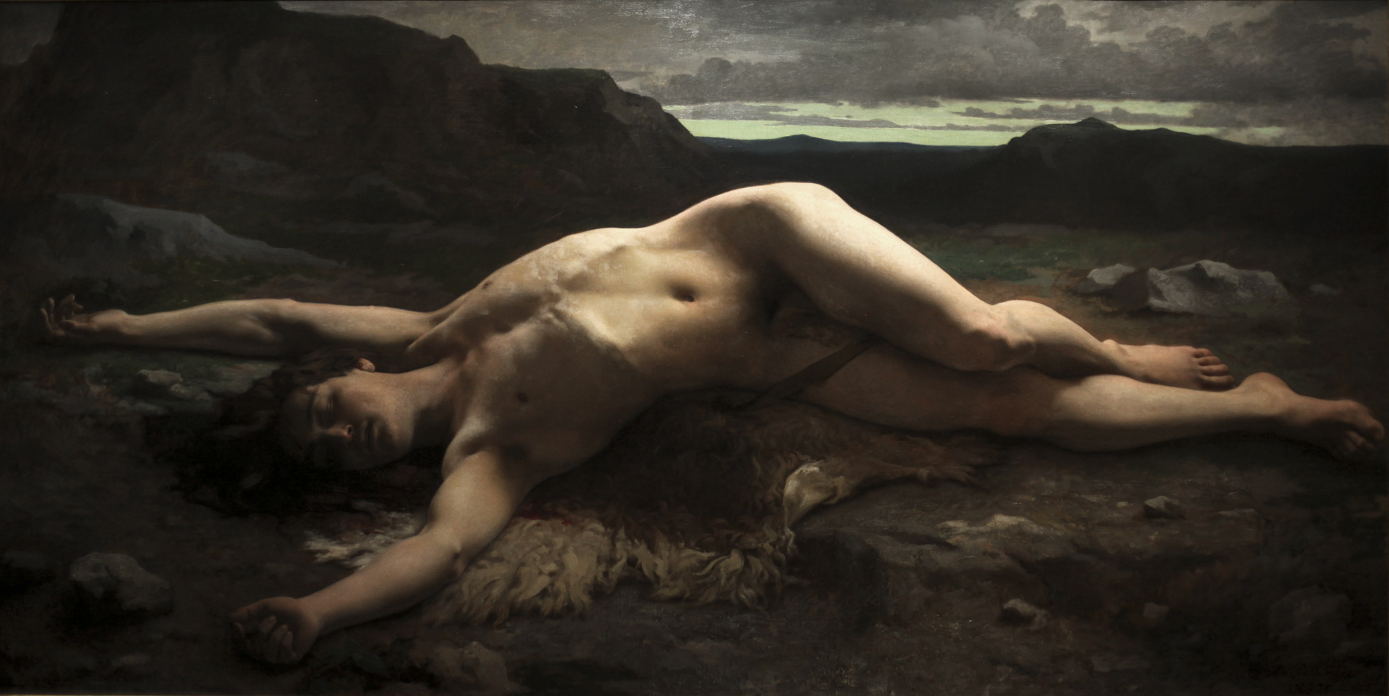
 'The Dying Saint Sebastian' 1789")
 'The Bath' 1951")
 'The Sleep of Endymion' 1791")
 'Mercury' 2001")


 'Les bains mystérieux' (Mysterious Baths) c. 1934-36")

 c. 1900")
 'Grand Guerrier avec Jambe' 1893-1902")
' 1935")


You must be logged in to post a comment.