Since colour has been a big story over the years at Auto Universum, I decided to expand on the recommended colour listing in The Allure of Period Colours and create this page to actually display examples of some of the AU Period Colours of the 1960s. Here are captivating alternatives to tedious blacks, reds, whites, greys, ivories and silvers all too often seen both on the road, and at Concours d’Elegance.
Automotive paint blenders work in relative obscurity, nevertheless they are true artisans; on par with the famed master blenders of Whisky, Champagne and fine Bordeaux.
While their brethren in the wine and spirits world mostly concentrate on maintaining a consistent house style, automotive colourists are tasked with developing alluring new colour blends each new model year with an eye to keeping au courant. Inevitably, the pressure of constantly recreating reds, blues, yellows and whatnot means there will inevitably be winners, losers and also-rans.
Here is a look at the cream of the 1960s crop, colours that were particularly enticing, popular and in some cases, both. These colours proudly display their connection to the era when they were produced, many unique to the decade.
If your favourite is not seen here, note that this page will be updated from time to time as new images are captured or submitted.
I see stars – Dom Pierre Pérignon
Without further ado, here is a selected sampling of roadworthy Star colours from the halcyon days of 1960s Jet Age style:
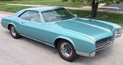
BMC Fiesta Yellow (YL 11) 1964-1968, seen here on Mini MkI with roof finished in Old English White (WT 3).BMW Florida (066/7023) 1960-1968, seen here on 1600-2. Pale greens were not as big a story as they were in the ‘50s, but they retained a loyal following in the sixties, none more than this cool mint green from BMW, usually paired with a contrastingly warm Tobacco interior.Buick Camelot Rose metallic (WA2982) 1962, seen here on Invicta. Also available at Oldsmobile as Sunset Mist. “Don’t let it be forgot, that once there was a spot, for one brief shining moment, that was known as Camelot.”Buick Coral Mist metallic (WA3240) 1964, seen here on Riviera. Also available at Pontiac as Sunfire Red. A stellar effort from GM Styling. Imagine red paint aged in Port barrels for a decade emerging mature and nuanced. Or a red that has gone to a finishing school in Switzerland. A masterwork in the art of pigment blending.Buick Turquoise Mist metallic (WA3305) 1965-1966, shown here on 1966 Riviera Gran Sport. Also available at Chevrolet as Artesian Turquoise, Oldsmobile as Ocean Mist and Pontiac as Reef Turquoise. Concurrent with the enthusiasm for Tiki and Polynesian motifs, turquoise was an immensely popular automotive colour in the 1960s for both interiors and exteriors, reflecting the enchantment of exotic Pacific islands.Cadillac Samoan Bronze metallic (WA3382) 1965, seen here on De Ville Convertible. Reminiscent of the Zombie cocktails enjoyed by Milton Berle and Andy Williams at the Kahiki Supper Club, this opulent bronze was the perfect complement to a Fleetwood Eldorado, Coupe de Ville or De Ville Convertible. Matching Bronze leather was available.Chevrolet Saddle Tan metallic (WA3111) 1963-1964, here on 1963 Corvette. Also available at Buick as Bronze Mist, Oldsmobile as Saddle Mist and Pontiac as Saddle Bronze. Golds were a favorite throughout the decade, but a challenge to develop. Too little gold and the result is an innocuous metallic beige; too much and the colour can end up looking garish. GM got it right with this one.Chevrolet Aztec Bronze metallic (WA3487) 1966, seen here on Chevy II Nova Super Sport. Also appeared on Buicks as Riviera Red and on Oldsmobiles as Autumn Bronze. In 1967 Pontiac offered it on Firebird as Sierra Red.Chevrolet Corvette Bronze metallic (WA3830) 1968. Shown here on Camaro SS Sport Coupe, it was offered on Corvette and Camaro. Twelve percent of 1968 Corvettes were covered in their namesake bronze that year, but only seven percent of Camaros. The colour disappeared for 1969, only to return in 1970 (for Corvette only) with a revised formulation.Chrysler Turbine Bronze metallic (MM-1) 1967-1968, seen here on 1968 Chrysler 300. This vivid bronze was originally developed in 1963 for Chrysler’s limited-production Turbine Car. When the Turbine Consumer Test Program was completed in January of 1966, Chrysler approved the use of Turbine Bronze for standard production cars, and hence the colour became available on 1967 Chryslers and Plymouths. Dodge offered the colour as Bronze, without Turbine nomenclature. A classic of the decade, it carries the extra allure of having graced the futuristic Turbine Car.Ford Chestnut metallic (M1470) 1962-1963, shown here on 1962 Galaxie 500 Club Victoria. Also available on Mercurys and Lincolns, Chestnut initiated the popularity of bronzes that became very much en vogue in the 1960s.Ford Peacock Blue (M1613) 1962-1963, seen here on 1963 Galaxie 500 Sports Hardtop. Introduced as a promotional colour for spring ’62, this pale aqua-blue became popular enough that it was offered again the following year.Ford Heritage Burgundy metallic (M1444) 1963, shown here on Falcon Futura Sports Sedan. Heritage Burgundy gained extra notoriety when future Drag Racing Hall of Fame member Gas Ronda chose it to adorn his ’63-1/2 427 Galaxie Lightweight.Ford Samoan Coral (M1637) 1964, Shown here on Galaxie 500/XL. Harkening back to the exuberance of the previous decade, it was the first colour of this hue from Ford since 1959’s Geranium. In keeping with the more tasteful atmosphere of the early and mid-sixties, it was more muted than similar shades from the fifties, but nonetheless a spirited colour. Ford offered Samoan Coral on only two models: Thunderbird and Galaxie 500. Mercury named it Bittersweet and made it available on Marauders and Comet Cyclone.Ford Emberglo metallic (M1921) 1965-1966, seen here on 1966 Mustang GT Fastback 2+2. Resembling a rich 20 year old Tawny Port, this vibrant bronze was introduced in 1965 exclusively for the Thunderbird Special Landau. For 1966 it was available on all Fords and Mercurys, and Lincoln offered it as Russett.Lancia Rosso Salmone (LS) 1965-1970, seen here on Fulvia Sport Zagato 1.3 SLincoln Aegean Bronze metallic (M2066) 1967, seen here on Continental 4-door Convertible. Offered on Fords as Burnt Amber, Shelby Mustangs as Bronze and Mercurys as Cinnamon Frost.Oldsmobile Saffron (WA3313) 1965-1969, seen here on 1967 442 Holiday Coupe. Offered as Bamboo Cream at Buick, Crocus Yellow at Chevrolet and Mayfair Maize at Pontiac. One of the most popular colours of the 1960s, it was introduced by General Motors on 1965 models. Inexplicably, it was dropped by Oldsmobile and replaced at Buick, Chevrolet and Pontiac by a pale yellowish-cream for 1966 only to be reintroduced by all four aforementioned divisions in 1967 to serve out the decade with its name changing to Butternut Yellow at Chevrolet and Cameo Cream at Buick. In 1969 it bid adieu in style, becoming one of a tiny handful of GM colours to be shared by the Cadillac Division disguised as Colonial Yellow. A sublime colour, it is saturated just enough to be clearly perceived as yellow without shouting about it. Its restrained elegance made it as appropriate on a Coupe de Ville or Starfire as on a GTO or Camaro.Oldsmobile Burgundy Mist metallic (WA3307) 1965-1969, here on 1966 442 Holiday Coupe. Another popular perennial of the 1960s, this majestic colour was introduced for 1965 at Pontiac, Oldsmobile and Buick; simultaneously it debuted at Chevrolet as Madeira Maroon. Enduring popularity kept it on the colour charts through 1969. Still unstoppable, it entered the next decade on 1970 Buicks as Misty Burgundy and on Chevrolet Chevelle and Monte Carlo as Black Cherry.Plymouth Medium Copper metallic (T) 1967, shown on Belvedere GTX.Pontiac Iris Mist metallic (WA3308) 1965, shown here on GTO Hardtop. Also available at Chevrolet as Evening Orchid.Pontiac Teal Turquoise, (WA3306) 1965, shown on GTO Convertible. Also available at Buick as Midnight Aqua, Chevrolet as Tahitian Turquoise and Oldsmobile as Turquoise Mist.Pontiac Autumn Bronze metallic (WA3867) 1968, seen here on Firebird 400 Hardtop. A beautiful colour reminiscent of a well-blended Barolo Chinato.Porsche Lido Gold (17656) 1966-1968, seen here on ’67 911S. A subtle, yet striking colour. Ivory, with a hint of mint.Porsche Burgundy Red (017) 1968-1971, seen here on 911S Targa.Volkswagen Beryl Green (L 478) 1961-1962, seen here on 1962 VW 1200. Likely due in part to the distinctive colour, this exact Beetle secured the People’s Choice award at the 2016 Beverly Hills Greystone Mansion Concours d’Elegance.Volkswagen Sea Blue (L 360) 1965-1966, seen here on 1966 VW 1300. Volkswagen offered three impressive colours in the mid-sixties that straddled the line between green and blue. Sea Blue was an beguiling blend of three blue and dark aqua pigments producing a range and depth comparable to gazing at the Mediterranean from an upper balcony of the Hotel Mirabeau.Volkswagen Java Green (L 518) 1964-1967, seen here on 1967 VW 1500. A spectacular jewel-like masterpiece evocative of the Caribbean off Nassau when the light is à point. Amazing spectral range; a triumph of blending.Volkswagen Bahama Blue (L 519) 1964-1966, seen here on 1966 VW 1300. A sublime aqua-grey, this is a colour of rare refinement, containing just sufficient blue, green (and ochre!) pigment to warrant calling it something other than grey. Brimming with subtle gradations, it transitions from slightly bluish at high noon to barely greenish at dawn and dusk.Volkswagen Yukon Yellow (L 19K) 1964-1970, seen here on 1970 VW 1500L Cabriolet. Slightly less saturated than Oldsmobile Saffron, this VW yellow was slightly more nuanced by the addition of about 2 grams per litre of green pigment. The green content also lowered its colour temperature, producing a really cool yellow. Available only on Convertibles from 1964-1970, it was also offered on North American market Sedans for the 1970 model year only.
Awesome! Wow, those are some beautiful cars in even more striking colors. Makes me dismayed at the amount of bland cars on the road today I see in grays and blacks and whites. While of course there’s nothing wrong with a nice dark grey from time to time (one of my Saabs is in such a shade), it’s nice to see something different for a change!
These were cars, they were individuals, each their very own style. We could tell from a 100 yards which car was which. Like everyone else wrote, they are pretty bland today, even their shapes are all quite similar. My 1963 Thunderbird was a very pale blue, almost white, originally. After some body work and a repaint, when I first saw it WOW! What a shock!. It was now light Blue (like a Robin’s egg). When I asked what happened, the painter said it was Ford blue. I told him, it’s not a Ford, it’s a Thunderbird. All T-Birds, from 1955 through 1966 were not Fords. Like Lincoln and Mercury, the Thunderbird was a stand alone division of the FOMOCO which, of course, also made (& makes) the Ford cars. The popularity and much lower price of the new 1964.5 Ford Mustang almost killed the T-Bird. From 1967 on it became a model of the Ford line and got very big. I later learned my Bird was painted Chalfonte Blue (an Aqua blue shade). I love the shape of my Thunderbird and I’ve come to like the color mistake MUCH BETTER than the original. Long live the 1960s cars and music!
It is indeed tragic that the world has mostly divested itself of colour most notable in the automotive vein in the proliferation of vehicles from white to black with a spectrum of greys in between. It is a testament on how we generally look at the world with an increasing sense of uncertainty……
I’m the owner of a 1965 Sea Blue L360 Beetle. I’m surprised you didn’t include Tropical Green Color Code L60A that I had on my 1974 Beetle. The same of similar color was also used on the BMW 2002 around the same year. Good write up, thanks!


I love these colors! It’s makes me realize how bland the automotive world is now, with almost every car in black, white, silver and grey.
Awesome! Wow, those are some beautiful cars in even more striking colors. Makes me dismayed at the amount of bland cars on the road today I see in grays and blacks and whites. While of course there’s nothing wrong with a nice dark grey from time to time (one of my Saabs is in such a shade), it’s nice to see something different for a change!
The Sea Blue and Java Green of the VW remind me of the captivating shades of the Mediterranean off the Croatian coast.
These were cars, they were individuals, each their very own style. We could tell from a 100 yards which car was which. Like everyone else wrote, they are pretty bland today, even their shapes are all quite similar. My 1963 Thunderbird was a very pale blue, almost white, originally. After some body work and a repaint, when I first saw it WOW! What a shock!. It was now light Blue (like a Robin’s egg). When I asked what happened, the painter said it was Ford blue. I told him, it’s not a Ford, it’s a Thunderbird. All T-Birds, from 1955 through 1966 were not Fords. Like Lincoln and Mercury, the Thunderbird was a stand alone division of the FOMOCO which, of course, also made (& makes) the Ford cars. The popularity and much lower price of the new 1964.5 Ford Mustang almost killed the T-Bird. From 1967 on it became a model of the Ford line and got very big. I later learned my Bird was painted Chalfonte Blue (an Aqua blue shade). I love the shape of my Thunderbird and I’ve come to like the color mistake MUCH BETTER than the original. Long live the 1960s cars and music!
It is indeed tragic that the world has mostly divested itself of colour most notable in the automotive vein in the proliferation of vehicles from white to black with a spectrum of greys in between. It is a testament on how we generally look at the world with an increasing sense of uncertainty……
I’m the owner of a 1965 Sea Blue L360 Beetle. I’m surprised you didn’t include Tropical Green Color Code L60A that I had on my 1974 Beetle. The same of similar color was also used on the BMW 2002 around the same year. Good write up, thanks!
I remember that color well, it was a nice green; but too new. This page only covers the 1960s, the pinnacle of the Jet Age.