
All colors are good. But some colors are better than others, and that’s why Pantone selects a Color of the Year. According to Pantone, the Color of the Year is “a symbolic color selection; a color snapshot of what we see taking place in our global culture that serves as an expression of a mood and an attitude.” Since the Color of the Year was introduced in 2000, we’ve seen the palate swing wildly from Radiant Orchid to Tangerine Tango, and less wildly from Aqua to Blue Aqua. Do they represent our “global culture?” Maybe not, but it’s always fun to see what they come up with. Not all symbolic color selections are created equal, so here is our ranking:
This Is A Boring Color
19. Sand Dollar – 2006
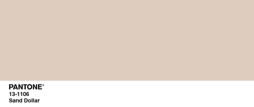
This color was only called Sand Dollar because Landlord Paint didn’t get past the Pantone Board of Directors. I’m going to sell my house and someone boring might buy it? Boom. Sand Dollar. Also while sand dollars themselves are pretty, the color of them is just sand. And sand is just ocean dirt.
All Aboard The Arbitrary Dislike Train
18. Marsala – 2015
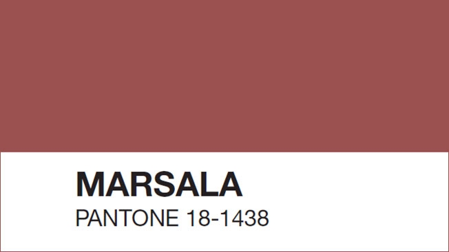
I arbitrarily dislike deep reds, but above that, I arbitrarily dislike colors that don’t know what they’re trying to be. Brown? Red? Tan? Rust? Mauve. Marsala is all of these and none of these at the same time.
17. Chili Pepper – 2007

If Sand Dollar is Landlord Paint, Chili Pepper is Dining Room Red. I even painted my parents’ dining room this color years ago. It’s perfectly nice, but plays into my arbitrary dislike of deep reds.
These Are The Same Color. Right? Pantone. These Are The Same Color.
14, 15, and 16, Aqua Sky – 2003, Blue Turquoise – 2005, Turquoise – 2010


Anyone who’s been to my house or seen my wardrobe knows that I love me some blues and greens. So does Pantone, or the universal zeitgeist as distilled into a color by Pantone, I guess. If there was just ONE turquoise-y color it might land near the top of my list, but I don’t know how to rank these so they’ll have to rank in the lower-middle. If you forced my hand I’d give the advantage to Blue Turquoise because it reminds me of the color they’d paint a water park in the ’90s …. or today, because every water park somehow lives within a 1993 time warp.
12 and 13, Tigerlily -2004 and Tangerine Tango – 2012

I love the peppy zip these colors bring to the Pantone family! I don’t love how they’re the same color. I’d have liked to see one orange with more pink to it, and one with more yellow, or something. I’m actually surprised that a true coral wasn’t chosen yet, as it’s been the accent color at every outdoor wedding since 2007.
I’m Pretty Sure This Is Cheating
10 and 11, Rose Quartz and Serenity – 2016
In 2016 Pantone really outdid itself by selecting two colors of the year: Rose Quartz and Serenity, better known as pink and blue. Pink and blue don’t really capture the essence of the global consciousness of 2016, although what COULD capture that year – puce? Baby poop green? If they capture the essence of anything, it’s a baby shower. Still, these two values are gorgeous. Serenity has a nice periwinkle hue and rose quartz is gentle but not babyish. But don’t think I didn’t notice that you picked two colors in one year, Pantone.
Lumpy Blue Sweater Color
9. Cerulean – 2000
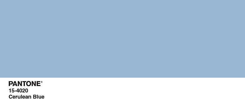
This color would rank lower but it has the distinction of being the only Color of the Year that is the subject of a Meryl Streep monologue.
“You go to your closet and you select… I don’t know… that lumpy blue sweater, for instance because you’re trying to tell the world that you take yourself too seriously to care about what you put on your back. But what you don’t know is that that sweater is not just blue, it’s not turquoise. It’s not lapis. It’s actually cerulean. And you’re also blithely unaware of the fact that in 2002, Oscar de la Renta did a collection of cerulean gowns. And then I think it was Yves Saint Laurent… wasn’t it who showed cerulean military jackets? I think we need a jacket here. And then cerulean quickly showed up in the collections of eight different designers. And then it, uh, filtered down through the department stores and then trickled on down into some tragic Casual Corner where you, no doubt, fished it out of some clearance bin. However, that blue represents millions of dollars and countless jobs and it’s sort of comical how you think that you’ve made a choice that exempts you from the fashion industry when, in fact, you’re wearing the sweater that was selected for you by the people in this room from a pile of stuff.”
Good Pink
8. Honeysuckle – 2011
This is a good shade of pink. While cloying if it’s the wall color for an entire room, it brightens up when paired with bright green or yellow and can look more understated with gray and cream.
‘Pop Of Color In Your Kitchen’ Color
7. True Red – 2002

Option 1: You redid your kitchen, everything’s all gray and subway tile, and you want to add a kitschy, cheerful, 1950s feel. You buy a vintage wall clock and fiestaware in True Red.
6. Greenery – 2017
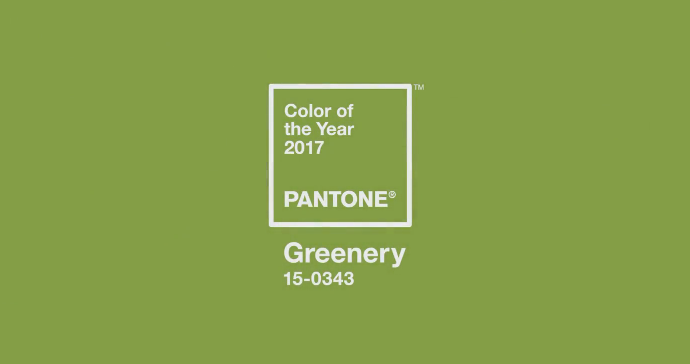
Option 2: You redid your kitchen, everything’s all gray and subway tile, but you want a pop of color that says that you enjoy the outdoors and love to cook with local, seasonal ingredients. That’s when you add some glassware or a painted island in Greenery. Greenery is fresh, it’s lively, and it works best as an accent color when things are a bit too Home Depot Special.
Better Pink
5. Fuschia Rose – 2001
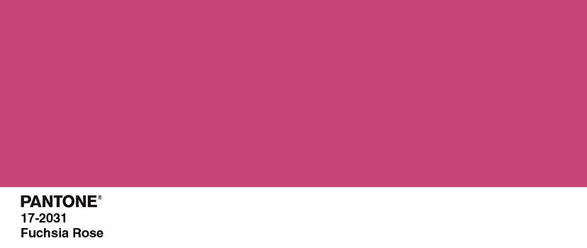
Fuschia Rose does what Honeysuckle was trying to do, but better. It’s poppy and fun, and it feels very 2001. We had only recently come out of the glittery, pop-infused late 90s and Carrie Bradshaw and all her friends were bringing playful feminine style to the forefront. I appreciate that Fuschia Rose knows what it is and really goes for it, pink-wise.
Normal Blue
4. Blue Iris – 2008
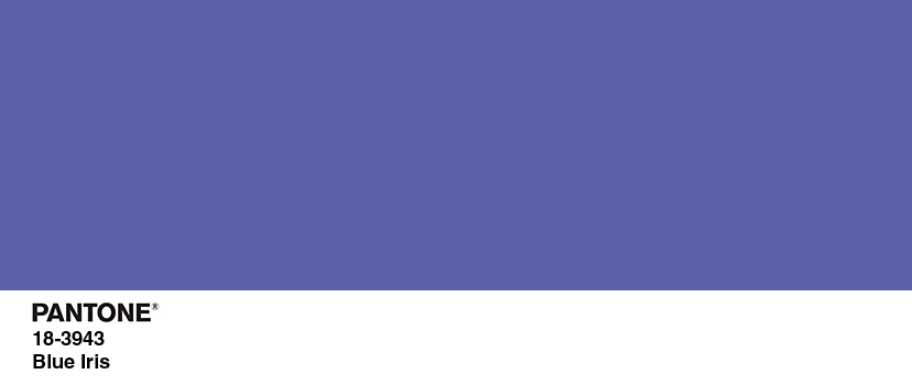
While Blue Iris sounds like a celebrity baby name or an independent film, it’s actually a very nice, normal shade of blue that pairs well with practically everything. Think of blue jeans: wear them with black or pastels or brights, they’ll always look good. Even though some of the punchier colors are fun, Blue Iris is the kind of color you could paint a whole room in or use as an accent throughout your house, and it would still look fine in ten years.
Normal Yellow
3. Mimosa – 2009
Mimosa is the only yellow Pantone has chosen (but sure, y’all needed THREE turquoises), and it’s nice and normal. That might sound like faint praise but it isn’t. It’s hard to find a yellow that’s not too bright or too soup-y. A perfect match for normal blue, normal yellows are optimistic and sunny. (I’m also biased because someone once said I have a great yellow aura. I don’t necessarily believe in that, but also that was years ago and now my aura’s probably … marsala.)
Now That Is A COLOR
2. Radiant Orchid – 2014
This was one of the only Pantone colors that actually surprised me. It’s a vibrant yet relaxing hue that looks amazing with all kinds of decor or style. I love a purple that’s not too grape-y or eggplant-y, but doesn’t delve into Easter Egg territory. I love you, Radiant Orchid.
A Totally Biased Top Pick
1. Emerald – 2013
I’ve always loved a true green. I was one of the only little girls I knew whose favorite color was green, not pink or purple (although I appreciate those too); relatives I seldom see still remember this and buy me things in this color. So this is totally ill-informed and arbitrary, but I loved when Pantone chose Emerald as their color of the year in 2013. Green can be as stately as shutters on an old mansion, or deep and lush like jungle plants, or crisp and classic paired with navy blue. When I studied abroad I used to walk past a boutique with a storefront ‘living room’ painted in emerald green and swear I’d paint a room that color one day. I still haven’t done it, but that’s what is so great about colors. They tap into feelings and memories and, sure, Pantone, “what we see taking place in our global culture that serves as an expression of a mood and an attitude.”


