The ExxonMobil Corporation, one of the world’s largest multinational oil and gas companies, has a rich history dating back to the late 19th century.
Established in 1870 as Standard Oil Company of Ohio, it has undergone several transformations, mergers, and rebranding efforts. Central to its identity and recognition is the company’s logo.
ExxonMobil’s logo is a visual timeline of the company’s evolution, capturing shifts in the energy industry, corporate responsibility, and environmental awareness.
Examining these changes highlights the company’s commitment to adaptability and innovation and offers insights into broader trends shaping the global energy landscape.

From the early days of Standard Oil to the modern, environmentally conscious design, each logo iteration tells a compelling story of ExxonMobil’s enduring legacy and its role in shaping the world’s energy future.
In this article, we will delve into the various iterations of the ExxonMobil logo, tracing its evolution from its inception to the present day.
We will explore how each version reflects the company’s changing values, vision, and global presence, ultimately making it one of the world’s most iconic and enduring corporate logos.
A Brief History of ExxonMobil
Before delving into the logo’s evolution, it’s essential to understand the history of ExxonMobil itself.
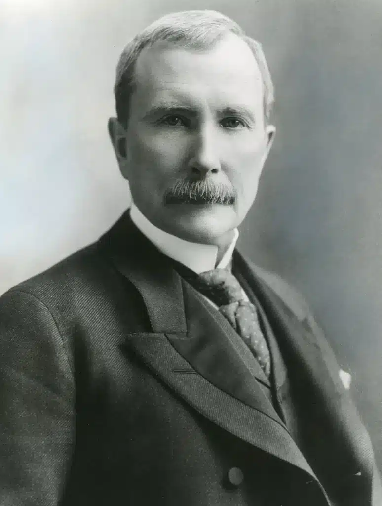
We can trace the company’s roots to the Standard Oil Company of Ohio, founded by John D. Rockefeller and his partners in 1870. Standard Oil grew rapidly, expanding its operations and dominating the American oil industry. However, it faced increasing scrutiny from regulators due to antitrust concerns.
In 1911, the U.S. Supreme Court ordered the dissolution of Standard Oil, leading to the creation of 34 independent companies, one of which was Standard Oil of New Jersey. This entity would later become Exxon, an integral part of the ExxonMobil Corporation.
In 1912, the iconic interlocking “ESSO” (from the phonetic pronunciation of “S” and “O”) logo was introduced, marking the beginning of a visual identity that would eventually evolve into the ExxonMobil emblem.

Exxon and Mobil, two of the most prominent companies resulting from the breakup of Standard Oil, continued to expand and diversify their operations throughout the 20th century.
In 1999, they merged to form ExxonMobil Corporation, a global energy giant with a presence in virtually every facet of the oil and gas industry, including exploration, production, refining, and marketing.
The Evolution of the ExxonMobil Logo

1892 – 1904
Tracing its lineage back to its predecessor, Standard Oil, is essential to better understand the evolution of ExxonMobil’s logo. This venerable corporation, which thrived during the late 19th and early 20th centuries, employed a series of logos that embodied simplicity and functionality.
The initial emblem of Standard Oil was marked by its straightforward design, featuring the company’s name in a robust and commanding serif typeface. Within the heart of a circular logo adorned with striking red, yellow, and gray hues, the words “Security Oil” assumed a prominent position. This logo communicated the company’s name and exuded a sense of reliability and trustworthiness, crucial in that era’s fiercely competitive energy industry.
Standard Oil’s choice of colors, red and yellow, conveyed vitality and energy, reinforcing the company’s position as a powerhouse in the oil industry. Incorporating the term “Security Oil” suggested a commitment to safeguarding its customers’ interests, fostering a sense of security among consumers when the industry was fraught with uncertainties.

1904 – 1908
In 1904 the company retained its iconic circular badge as its emblem, with a noteworthy alteration.
The symbol now sported a rich and captivating deep blue backdrop, accentuated by a striking crimson line that gracefully traced the outline of a smaller circle within.
Within this inner circle, a distinguished emblem proudly displayed the abbreviation “SOCONY” in a sleek and modern sans-serif font.
This abbreviation stood for Standard Oil Company of New York, a name synonymous with innovation and excellence in the petroleum industry during that era.
The “Standard Oil Co. of New York” moniker was prominently emblazoned along the lower border. This striking design evolution symbolized the company’s commitment to progress and represented a captivating blend of style and substance that would become emblematic of its enduring legacy.

1911 – 1931
Pegasus debuted in the early 1900s. This initial logo rendition featured a minimalistic monochromatic design, exuding simplicity, reliability, and approachability. When elaborate logos were not the norm, Pegasus stood out with its striking visual identity. Its elegance spoke volumes about its commitment to delivering trustworthy and accessible services. Over the decades, Pegasus has evolved, but its enduring legacy as a symbol of trust and dependability resonates with audiences worldwide.

1923 – 1934
During the 1930s, the company’s Esso brand underwent a visual transformation that reflected the era’s spirit and conveyed a strong patriotism and trustworthiness. At the heart of this transformation was the brand logo, which took on an oval shape adorned with the iconic red, white, and blue colors. This color scheme evoked a sense of national pride and symbolized the company’s dedication to quality and excellence. The brand name, rendered in a robust and bold typeface and combination of design elements, not only captured the essence of the times but also solidified Esso’s position as a trusted and enduring brand to consumers.

1931 – 1932
During the company’s evolution into Mobiloil, they adopted a distinctive emblem to symbolize their brand identity. This emblem featured a captivating crimson gargoyle, a bold and memorable symbol of the company’s ethos. The word “GARGOYLE” was elegantly inscribed, and just below this striking image, the company’s name is in a refined black serif typeface, adding a touch of sophistication and timelessness. This combination of the evocative gargoyle and the tasteful typography conveyed a message of strength, reliability, and tradition.

1932 – 1959
After just a year of employing the Gargoyle emblem, the majestic crimson Pegasus soared into the limelight, becoming the focal point of the brand’s identity. This transformation also ushered in a more refined and minimalist aesthetic, as the brand name was elegantly reimagined in a sleek sans-serif font. This redesigned logo symbolized the company’s enduring reliability and strength, remaining unchanged and steadfast for over two decades.

1932 – 1939
The Pegasus emblem continued to play a central role as it was incorporated within a shield, serving as a powerful symbol for the gas products associated with the brand. This iconic emblem prominently showcased the word “Mobilgas,” in a rich azure, positioned atop the bold and distinctive lettering of “SOCONY-VACUUM.”
The deliberate integration of the Pegasus emblem, nestled within the shield, symbolized the brand’s commitment to quality and innovation in fuel products. This emblematic composition conveyed a sense of reliability and a legacy of excellence that had become synonymous with the Mobilgas brand.
Incorporating the Pegasus within the shield was a masterful choice, creating a distinctive logo that continues to evoke a sense of nostalgia while reminding us of the enduring legacy of Mobilgas in the world of energy and transportation.

1939 – 1955
In 1939, Mobilgas underwent a significant transformation in its brand identity, marking a pivotal moment in its history. The iconic Pegasus, a symbol of speed, grace, and mobility, remained at the heart of the logo, but it underwent a thoughtful redesign. The essence was to streamline the logo’s appearance, resulting in a sleek, minimalist representation. The once elaborate emblem was now elegantly simplified into a single blue outline encircling the majestic Pegasus.
The typeface assumed a refined and professional demeanor, exuding dependability. The new logo struck a harmonious balance between professionalism and friendliness. This redesign in 1939 reflected Mobilgas’ commitment to evolution and solidified its enduring presence as a trusted and iconic brand in the automotive industry.

1955 – 1966
When the company adopted the renowned brand name “Mobil,” it embarked on a transformative journey that included unveiling a fresh and dynamic logo design infused with a vibrant blend of blue and red hues. It adopted a sleek rectangular shape at its upper end and gracefully tapered into a pointed formation at the bottom.
At the heart of this design was the majestic Pegasus, in a striking shade of crimson, symbolizing power and grace.
Complementing this image was a wordmark in a blue sans-serif typeface that communicated the brand’s modernity and professionalism. This logo displayed Mobil’s commitment to progress and innovation.

Variation in the 1990s
When Exxon and Mobil became one in the 90s, they created one of the world’s largest and most influential energy companies. They then had to create a new logo representing their combined strength and global presence.
The new ExxonMobil logo retained the essence of the Exxon emblem but also incorporated elements of Mobil’s identity. The result was a striking, stylized wordmark that combined Exxon’s distinctive “X”s and Mobil’s blue palette. The bold capital letters conveyed authority and confidence, while the blue represented stability and trust.
The ExxonMobil logo’s design was a masterful fusion of the two companies’ legacies, symbolizing their unity and shared commitment to excellence.
1964 – Today
The logo dispenses with unnecessary embellishments, relying solely on the sheer recognition of the well-established brand name. Mobil’s iconic brand name takes center stage, rendered in a striking sans-serif typeface.
The letter “o” in “Mobil” stands out prominently; its vibrant red hue is a powerful focal point, symbolizing energy, dynamism, and the company’s enduring commitment to innovation.
Why the ExxonMobil Logo Is So Good
The success and longevity of the ExxonMobil logo can be attributed to several key factors:
Simplicity
The logo’s simplicity and clean design make it easily recognizable and memorable. The bold lettering and interlocking “XX” symbol create a solid visual identity instantly associated with ExxonMobil. This simplicity ensures the logo can be easily reproduced across various media and sizes without losing its impact. It also allows for quick brand recognition, even from a distance or cluttered visual environment.
Consistency
ExxonMobil has maintained a consistent color palette and design elements over the years. This commitment to consistency fosters a sense of trust and reliability among consumers. When people see the familiar red and blue colors and the interlocking “XX” symbol, they know they are dealing with a company they can rely on. This consistency also helps reinforce the brand’s long-standing presence and reputation in the industry.
Global Appeal
The name “Exxon” and the “XX” symbol in the logo have universal appeal, allowing for easy pronunciation and recognition worldwide. This makes ExxonMobil a global brand that transcends language barriers and cultural differences. The logo’s design is not tied to any specific cultural or regional elements, making it accessible to diverse audiences across the globe.
Legacy and History

The logo carries the legacy of Exxon and Mobil, two companies with solid reputations for quality and innovation in the oil and gas industry.
When consumers see the ExxonMobil logo, they are reminded of these two iconic companies’ rich history and contributions to the energy sector.
This legacy adds a layer of trust and credibility to the brand, as it is associated with decades of industry leadership.
Adaptability
While the core elements of the logo remain unchanged, ExxonMobil has adapted to changing marketing and branding trends, ensuring its logo remains relevant in the digital age.
The company has incorporated its logo seamlessly into various digital platforms, from websites and social media profiles to mobile apps. This adaptability allows the brand to stay current and maintain its strong presence in the digital landscape.
Symbolism
Using red in the logo symbolizes energy and vitality, reflecting the core focus of the oil and gas industry. It conveys a sense of dynamism and the power associated with energy production.

On the other hand, blue represents stability and trust, aligning with the values of reliability and dependability that consumers expect from a major energy company like ExxonMobil.
Combining these colors reinforces the company’s commitment to delivering energy solutions with integrity and quality.
The evolution of the ExxonMobil logo is a testament to the company’s ability to adapt and thrive in a constantly changing industry.
From its humble beginnings as Standard Oil to its present-day status as a global energy giant, the logo has reflected the company’s values, vision, and commitment to excellence. Its enduring design, simplicity, and international recognition make it a shining example of effective corporate branding and a symbol of the energy industry’s past, present, and future.
Check out these awesome Logo Contests run on Hatchwise: