


Vellum Venom: 1966 Datsun Sports 1600 (Fairlady)

Can you remember when sports cars were a staple of design studios? When these wee-beasties were vellum fodder like today’s CUVs? Me neither. But Europe once made these in spades, and–much like today’s utility vehicle craze–Japan regularly followed suit. Let’s examine that rich history with a deep cut into Nissan’s “Fairlady” series.
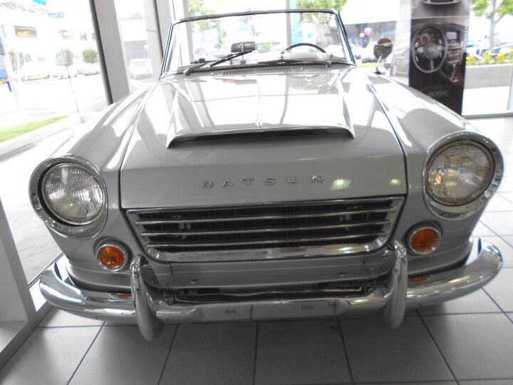
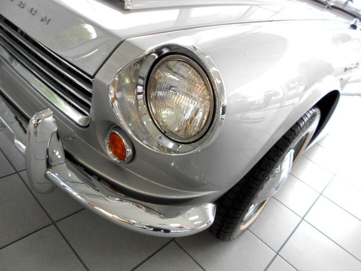
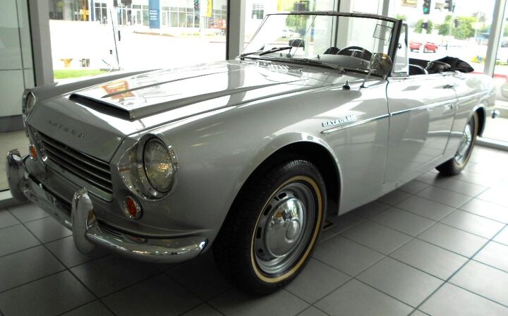
Let’s be clear, the Datsun 1600 will never win a beauty contest if comparable Euro Metal enters the show. Like most Japanese cars from this era, the styling was far more agricultural and cost-effective: uber voluptuous fenders, lumps, bumps and curves need not apply. The 1600’s box-nosed face belongs on today’s family sedan, and the bumper looks like an afterthought compared to the sexy slope of the MGA’s integrated maw. But the clean (well-organized) lines and tidy details (i.e. well placed signal lights) still makes it a timeless classic.
The practical charm of such nostalgic Japanese iron is clear to every eyeball. Heck, there’s even a fantastic website dedicated to the hobby. Check it.
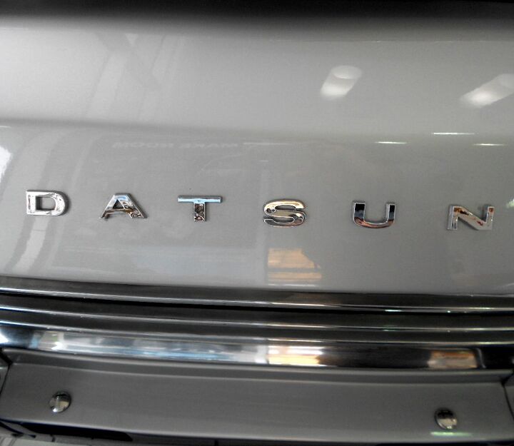
There’s nothing wrong with a basic design when details like the grille and emblem are presented in such a clean and logical manner. This is why cheap(er) cars are as cheerful as more expensive iron.
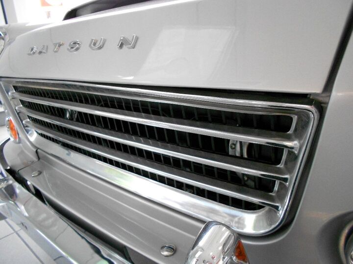
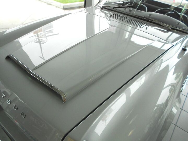
What really makes the Datsun 1600’s nose stand out is the integrated grille/hood cut line. Simply put, the ends of the grille match the beginning(s) of the hood. It may seem like a little detail, but go back to the 2nd photo: doesn’t that make everything right on that face?
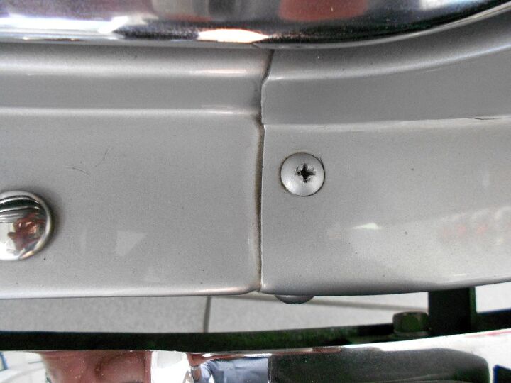
My, how things change with time! Body parts were screwed together back then? No biggie: it’s part of the historical charm of many cars from this era. Not having seen similar British/Italian machines up this close, I don’t know if screwing the front end in such a visible location is par for the course, or part of the Datsun’s value appeal.
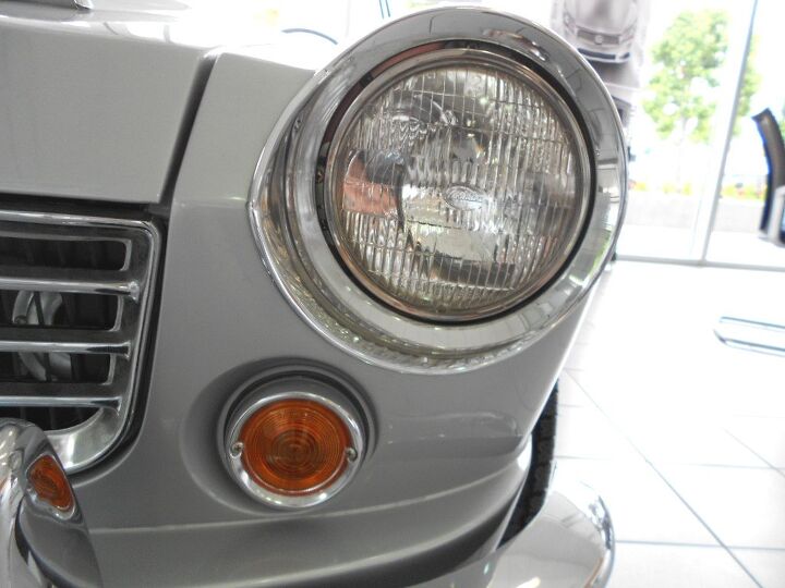
I like the scalloping around the signal lights, a subtle touch to make these (universal?) parts look somewhat more unique to this machine. The crease near the headlight’s center line is nice, but it’d be even nicer if they centered the headlights (i.e. slightly lower) to match it. Lowering the headlights would also help “visually lower” the front end. If the engineers would allow it.
But look at how elegant the front clip appears with the minimal cut lines from the hood+grille treatment!
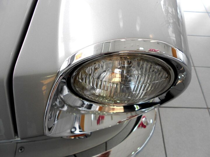
Again, lower the headlights so they “center” with that very cool crease in the front fascia. That said, this proto-240Z shows the future nosejob for the Fairlady of the 1970s.
The Datsun 1600’s other hard crease, at the top of the fascia and hood, could use some softening up to empathize with the headlight’s round form: another issue cured by the elongated schnoz of the 240Z.
My need for a rounder top and “centered on the crease” headlights comes to light (sorry) from this angle. The biggest problem is how that hard fold at the top fights with the rounded headlights and turn signals.
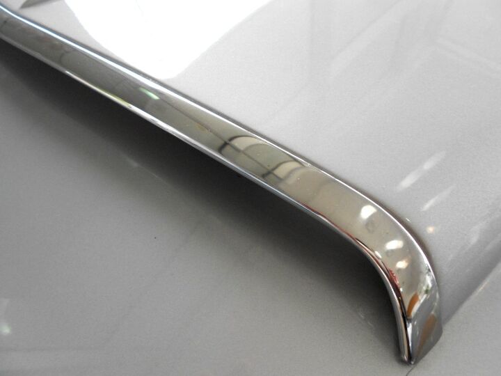
The chrome trimming at the leading edge of this hood scoop is quite the expensive looking touch! Nice job.
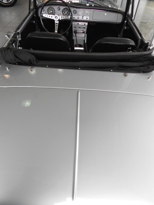
While the snub-nosed face with too many hard edges isn’t the best start for a 1960s sports car, the hood and fenders sweep back quite nicely to compensate. How I long for the days when every automaker had at least one car with a looooooong hood! Which leads to a discussion of “dash-to-axle ratios”…but I’m getting ahead of myself.
Indeed, that space between the dashboard and the front axle. The more you have, the more inherently bad ass your vehicle becomes! The Datsun 1600’s snub nose really kills the mood when you consider the hustle and flow of all those complementary lines from the headlights alllll the way back to the windscreen. Yum.
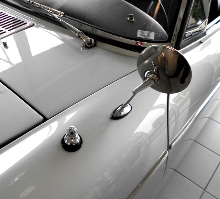
I love how this elegant and delicate side view mirror’s base compares to (almost?) anything from the 1970s and beyond. While this could be an afterthought/necessity to comply with US safety guidelines, it’s a delightful design element. The problem is that wart of an antenna(?)…it’s like seeing a pretty girl with a not so handsome guy at a black tie event.
That’s one lucky chrome wart, I say! Or maybe he’s well endowed. Whatever.
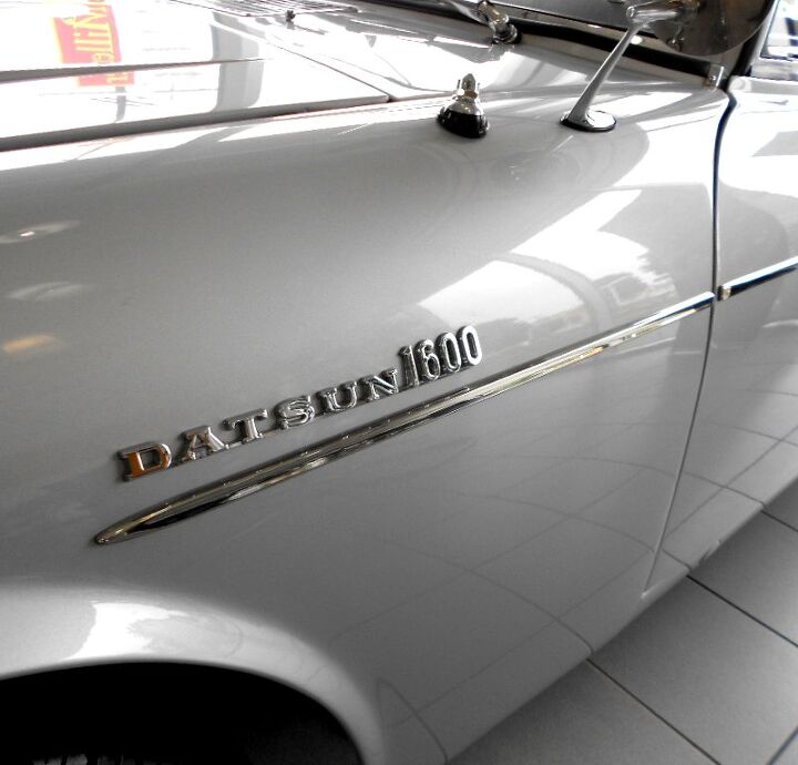
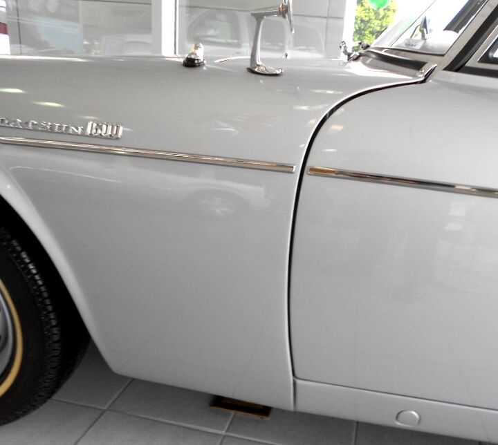
These emblems, while cool by themselves, are far too chunky to live here. They kill the flow. Put them further down the fender, perhaps halfway between the chrome moulding and the base of the wheel arch.
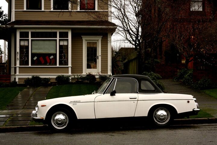
Sadly the Datsun’s poor location ruined my side shot, so this hardtop’d interweb photo will suffice. The upright windshield rake and static vent windows make this body look cuter and dumber than the more refined metal from Europe. But perhaps that ain’t no big thang since it echos the boxiness of the front end.
And isn’t it refreshing to see such an advantageous ratio of side glass to side sheet metal these days?
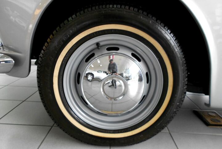
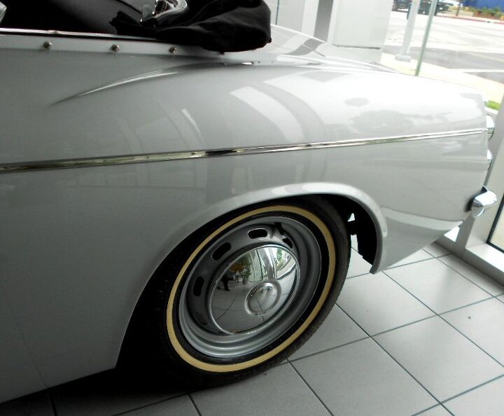
Dare I call this wheel design a classic from this era? Purely functional, but elegant and modest. Ditch the whitewalls, but the sliver slotted steelies with a big face chrome center cap is an element I’ve loved on Porsches, VWs…and Datsuns!
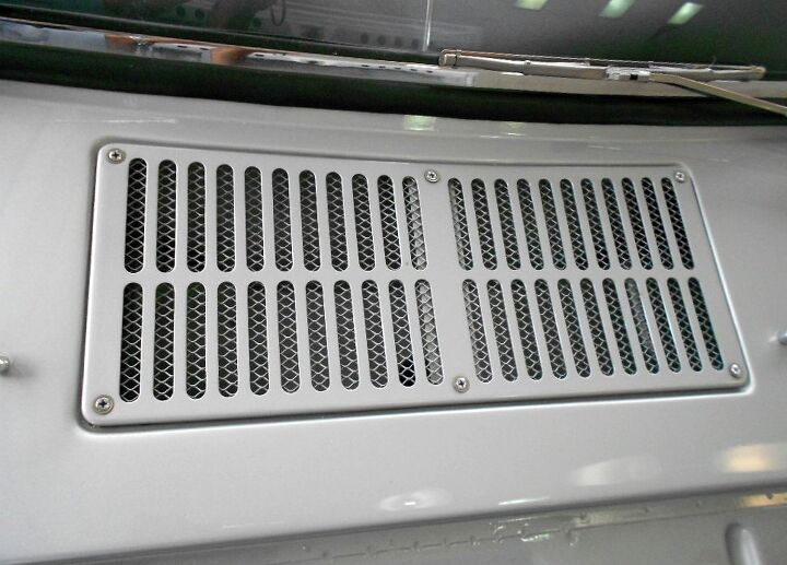
While the exposed screws on the front end look a bit cheap, these fasteners on the cowl vent have a functional beauty about them. Maybe it’s the silver paint and how this could be a close up on any number of brilliant European sports cars from the 1950-60s, but it just plain works.
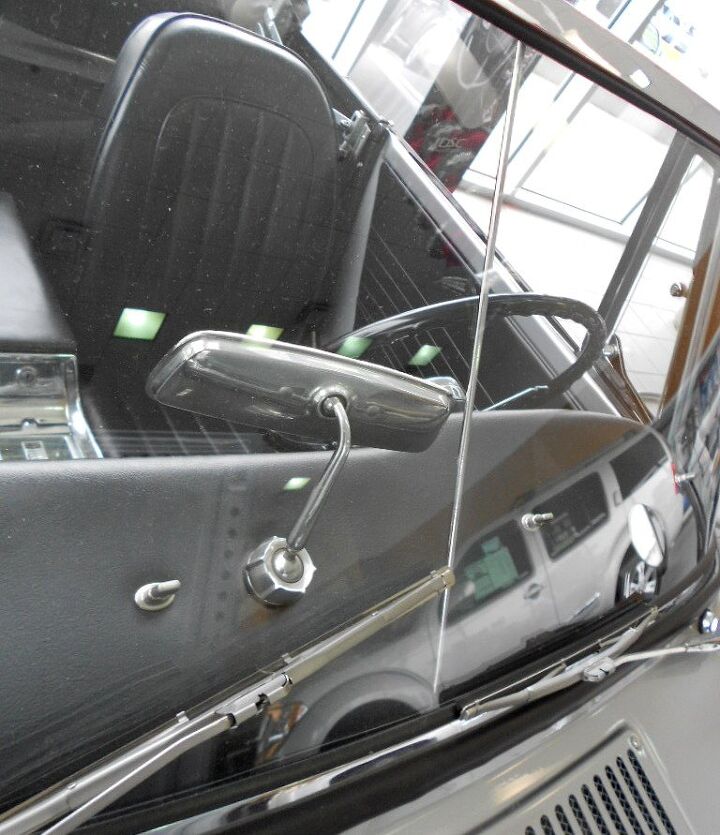
Two window panes to make one windshield? If only Datsun sprung for a fancier sheet of glass in their bargain basement roadster. That said, the chrome details in the wiper arms, rearview mirror, windshield rubber, etc. look fantastic in their close up shot. Ditto those exposed screws on the cowl vent.
Back again to the fantastic real estate between the dashboard and the front axle. Be it a lovely Ferrari or a lowly Datsun, this is always a delicious treat that’s good for the car enthusiast’s heart and soul.
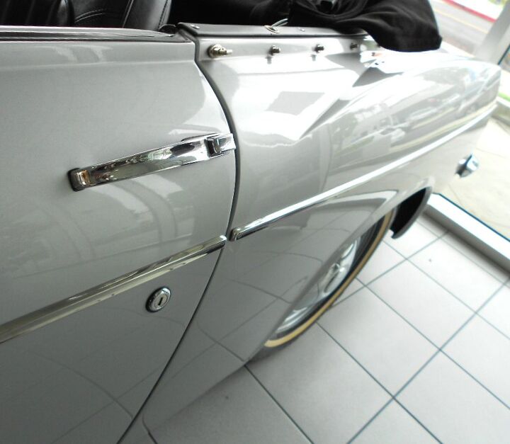
The chrome trim is modest enough, but its location between the door lock and door handle appears clumsy as you approach from this angle. This might be the only car more deserving of a body side molding delete than a C5 Corvette.
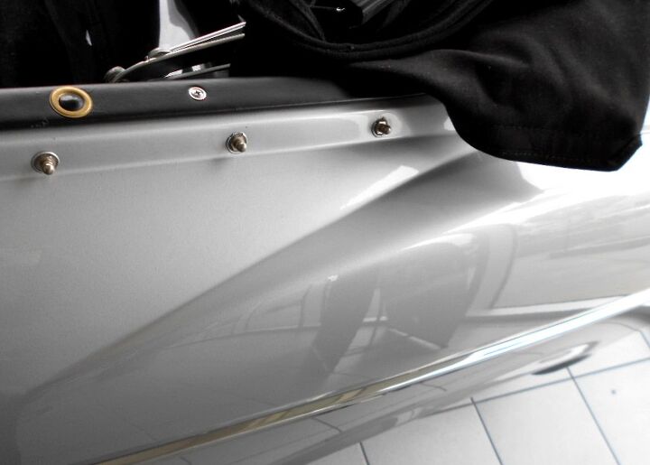
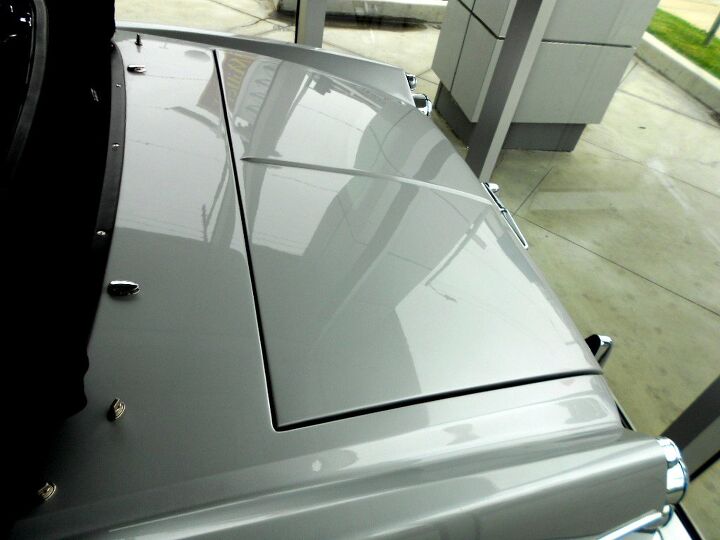
The ragtop’s boot cover buttons are super-static on this otherwise flowing form. Is it possible to bend that panel a few degrees in, more aggressively inward as it nears the rear, and still make the buttons snap to engineering specifications? If possible, it’d certainly help the look.
Just an ever-so-gentle inward bending: I’m not expecting a Talbot Lago from a reasonable and honest Datsun, but give us a little taste! And here’s another good reason to eliminate the chrome trim. From the subtle curves of the quarter panel to the soft contours of the wheel well, the Datsun 1600 is begging for someone to remove its rigid orthodontia.
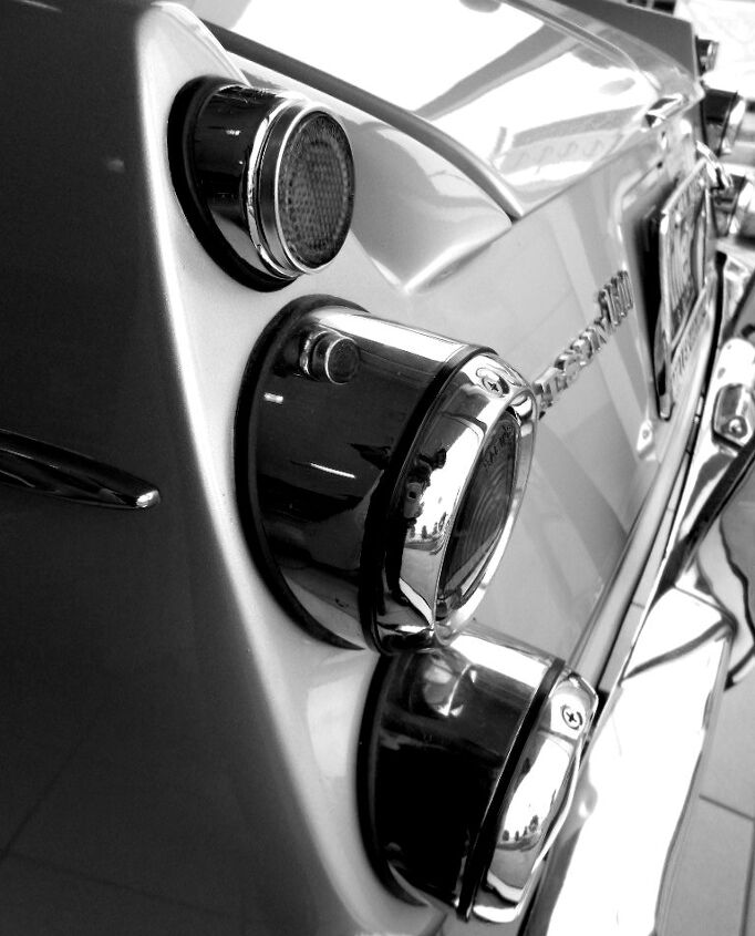
And let’s round out the trunk’s cut line…this is brutally rigid. It’s obviously cheaper than the goodies coming from Britain and Italy at this time. While there are other hard edges and elements in this design that must stay, this one needs the boot…from the boot!
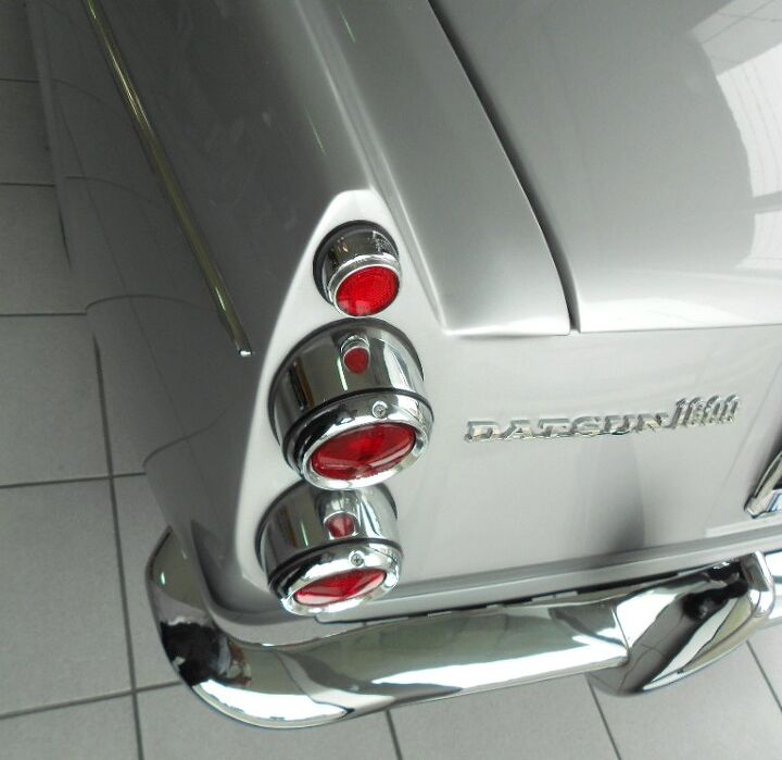
There’s a strong homage to the Aston Martin DB4 and DB5 presented here. Or perhaps it’s just a cheap knock off. That’s fine, but punishing the eyes with the “visual sound” of fingernails on a chalkboard comes from the brutally hard edges connecting the rear fascia to the quarter panel. My kingdom for a little more money to round out some panels! Please!
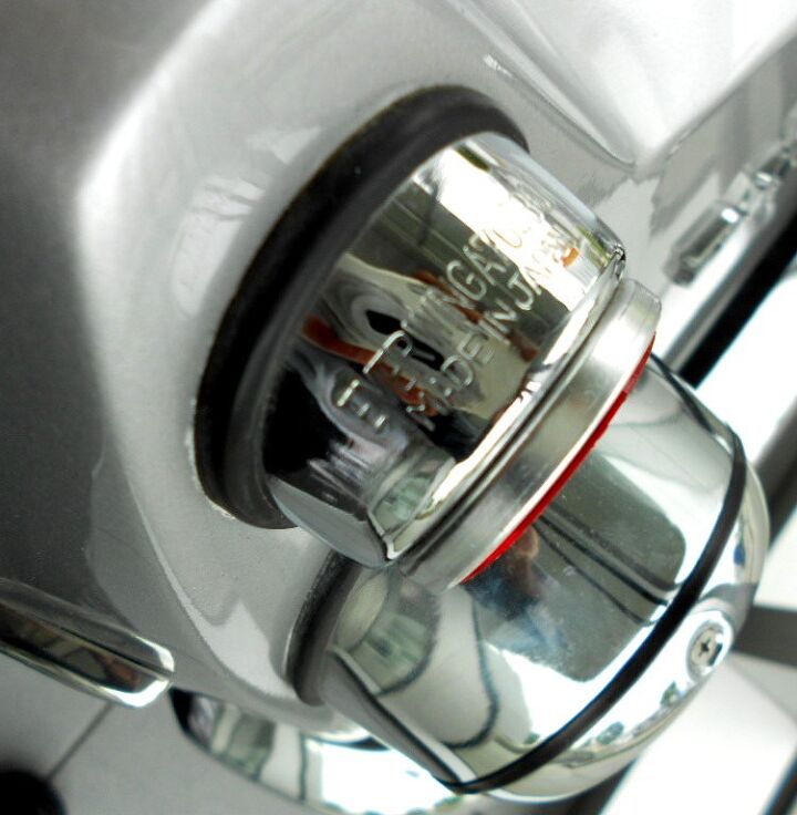
Generation Gap: whatever that says and no matter how poorly integrated it may seem, at least those aren’t Lucas Electronics. Some scalloping/recessing a la the front signal lights would be nice, too.
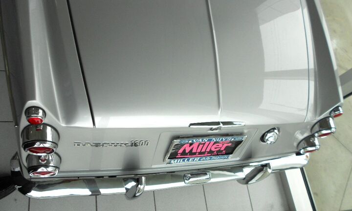
Too many hard corners and Aston Martin rip offs aside, this is a pretty wicked rear end. Note how the trunk cutlines seemingly disappear like an infinity pool in some fancy spa with overpriced meals and minimalist music piped into every hallway. Nice.
This might be the best angle to photograph. A well-organized and classically minimal interior only highlights the curvature of the Datsun 1600’s decklid. And the subtle rib down the middle? Perfection.
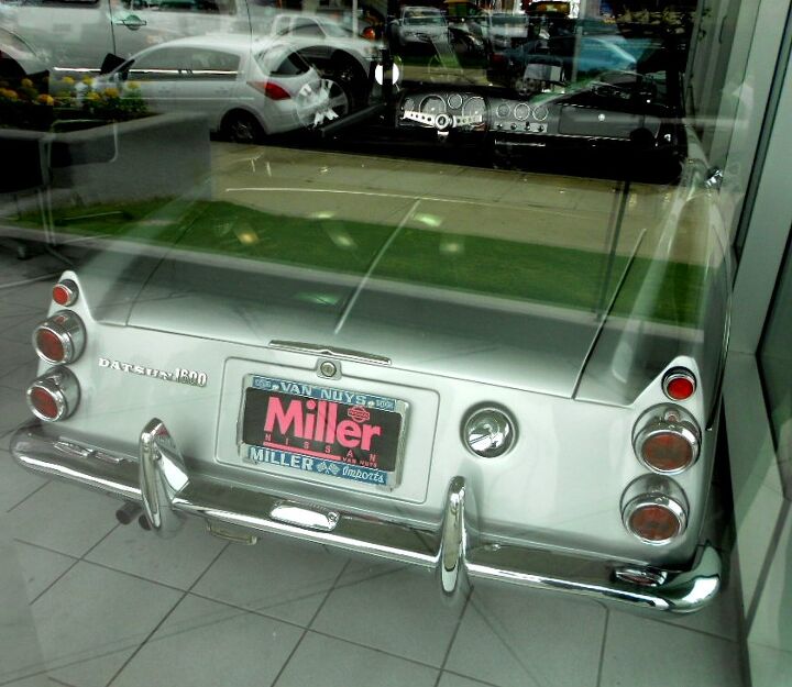
Sorry about not blurring the license plate, but this dealership changed names! Too bad the Datsun 1600’s location was less than ideal for photography. But shooting outside shows the Datsun 1600’s flat butt…and Cindy Crawford worthy birthmark (gas cap) too.
Note the especially clean integration of the deck lid, rear fascia and quarter panels in a single line at the top. Nice-ish…too bad it all ends on a butt that needs a little Sir Mix-a-Lot in its life.
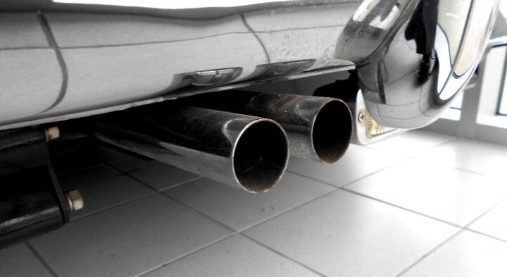
Requisite twin chrome exhausts are always welcome ’round these parts. The leaf spring perches (left) and back up light (right) are interesting throwbacks to a simpler, stupider time.
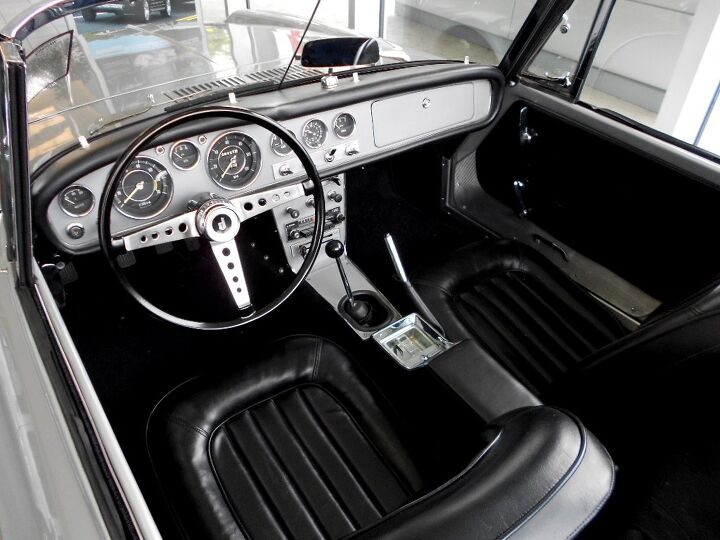
And since the top was indeed down, the Datsun 1600’s interior plays an integral role with the exterior design. And, simply put, this is a fabulous interior. There’s nicer bits from the Europeans, but that’s all relative. Datsun’s intelligent and cohesive design is an Everyman’s ergonomic and stylistic wonder. It’s what IKEA is to modern furniture, and it’s damn good-looking.
Thank you all for reading, I hope you have a lovely week.
More by Sajeev Mehta


Comments
Join the conversation
Never owned one, but spent a lot of time in one cruising the coastal towns of SoCal when I lived in Dana Point for a time in 76'. Great little car.
Historically, Japan's emergence into the first world back in the mid 19th century was patterned after the British Empire and British institutions.The Fairlady was Datsun's tribute to the British Sports car. Except better mechanically. If you de -badged it, it could have been from British Leyland or the Rootes group. Thanks for the article.